
Animal Crossing: New Horizons
UX/UI Redesign
role
UX/UI Passion Project
Scope
UX Research, Wireframing, High-Fidelity UI Design
Industry
Gaming
Timeline
2026
introduction
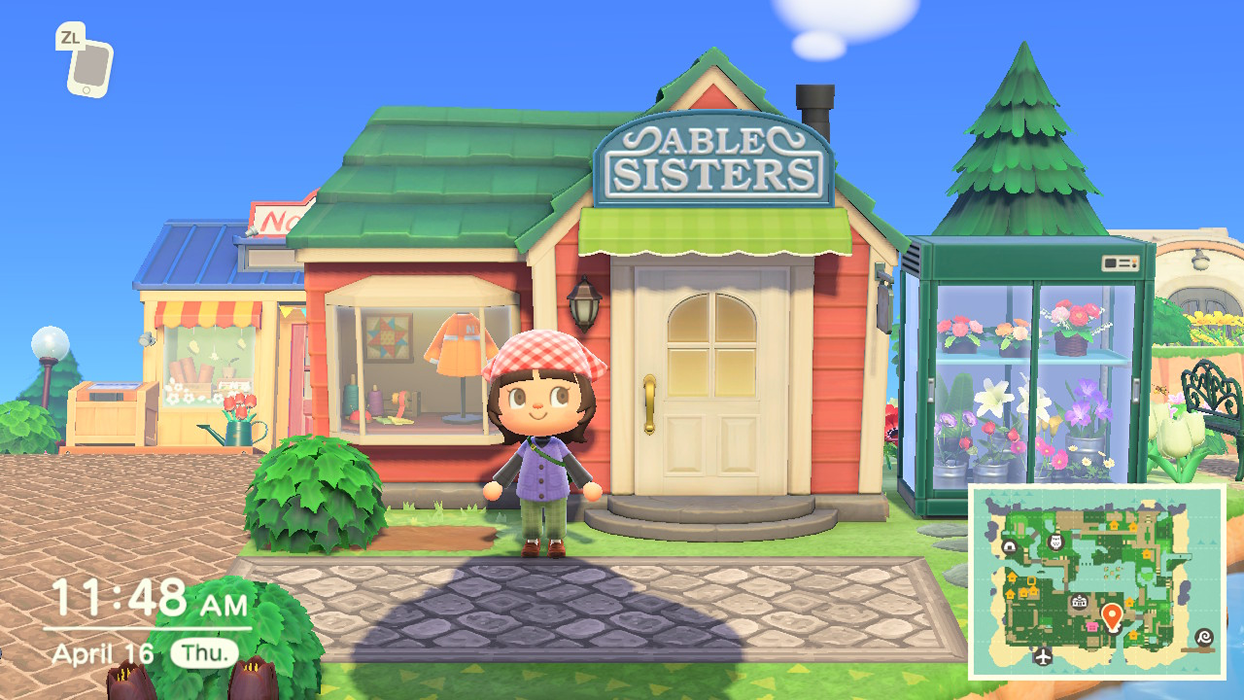
Animal Crossing: New Horizons is Nintendo’s cozy life sim where you build and decorate your own island at your own pace – no pressure, no rush. As much as I love this game, the UX has always driven me a little crazy as an avid player. The game has a habit of slowing you down in all the wrong ways – and not in the relaxing, cozy way it intends to. Menus are hard to navigate, you’re forced to sit through the same dialogue on every visit, and simple tasks take way more steps than they should.
As both a longtime player and a UX/UI designer, I couldn’t help but ask: what would this game look like if it actually worked as well as the rest of the game feels? This passion project is my answer to that – a concept redesign focused on three pain-point areas that frustrate me most as a player: the Nook Shopping experience, the Able Sisters clothing store restrictions, and the Museum donation flow.
objectives
Identify and document the most significant UX friction points across three core game systems through firsthand player research
Overhaul the Nook Shopping catalogue with a deeper information architecture, metadata-aware search, and aesthetic filtering – making items easier to find and browse
Remove unnecessary restrictions in the Able Sisters clothing store to give players more control over their shopping experience in a single session
Streamline the Museum donation flow to reduce repetitive dialogue and unnecessary steps without stripping the charm and personality of the experience
Deliver a high-fidelity UI redesign that stays true to ACNH’s visual identity while introducing new design elements that feel native to the game
The Process – research & problem definition
from frustration to focus
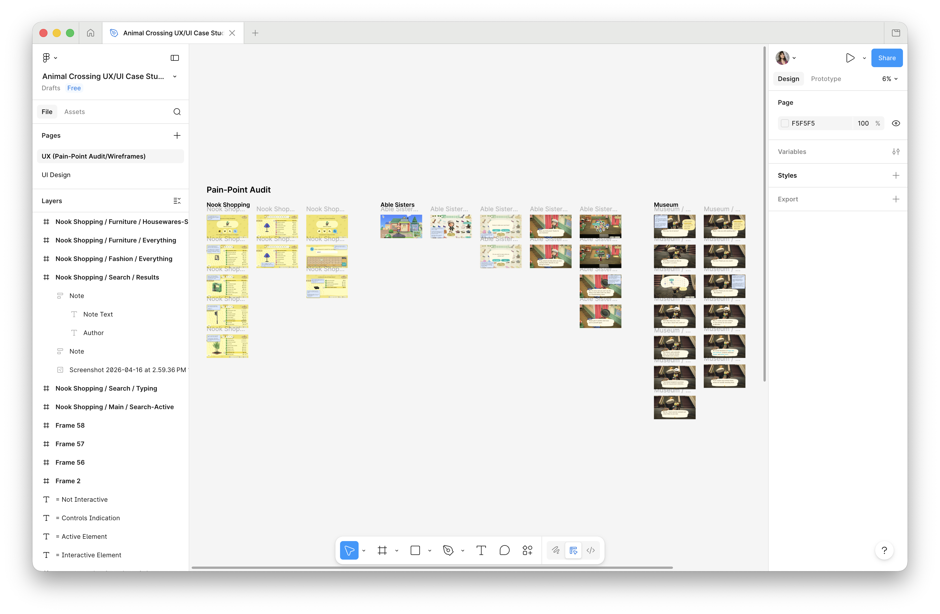
This project started with a question I’d been asking myself as a player for years: why does a game this charming feel this frustrating to navigate? As a longtime Animal Crossing player, I already had years of firsthand experience with the game’s pain points. I did a full audit of every frustration I’d accumulated as a player, working through the game system by system – then narrowed the focus to three areas where the problems were significant, specific, and worth solving.
- Conducted a full pain point audit across 10+ game systems
- Captured and annotated gameplay screenshots for each focus area
- Narrowed scope to three focus areas: Nook Shopping, Able Sisters, and the Museum
- First-time collaboration with Claude (by Anthropic) – utilizing the tool as a research and thinking partner throughout – pressure-testing UX arguments, researching game data, and refining rationale copy
- Note: Given the nature of this as a passion project, formal user research was outside scope – primary research was conducted through firsthand play experience and informal input from fellow friends and family players. Ideally, a project like this would begin with structured user interviews and usability testing to validate pain points beyond my own experience as a player
Process – UX & Information Architecture
built around how players actually think
Every redesign decision was rooted in the same core argument: the game’s UI creates unnecessary friction that works against its own design philosophy. The goal wasn’t to reinvent the experience – it was to make it work as well as it should have from the start. All 20 screens were wireframed and annotated at Switch resolution (1280×720) before any visual design decisions were made, ensuring every layout and interaction was solved on paper before aesthetics entered the picture.
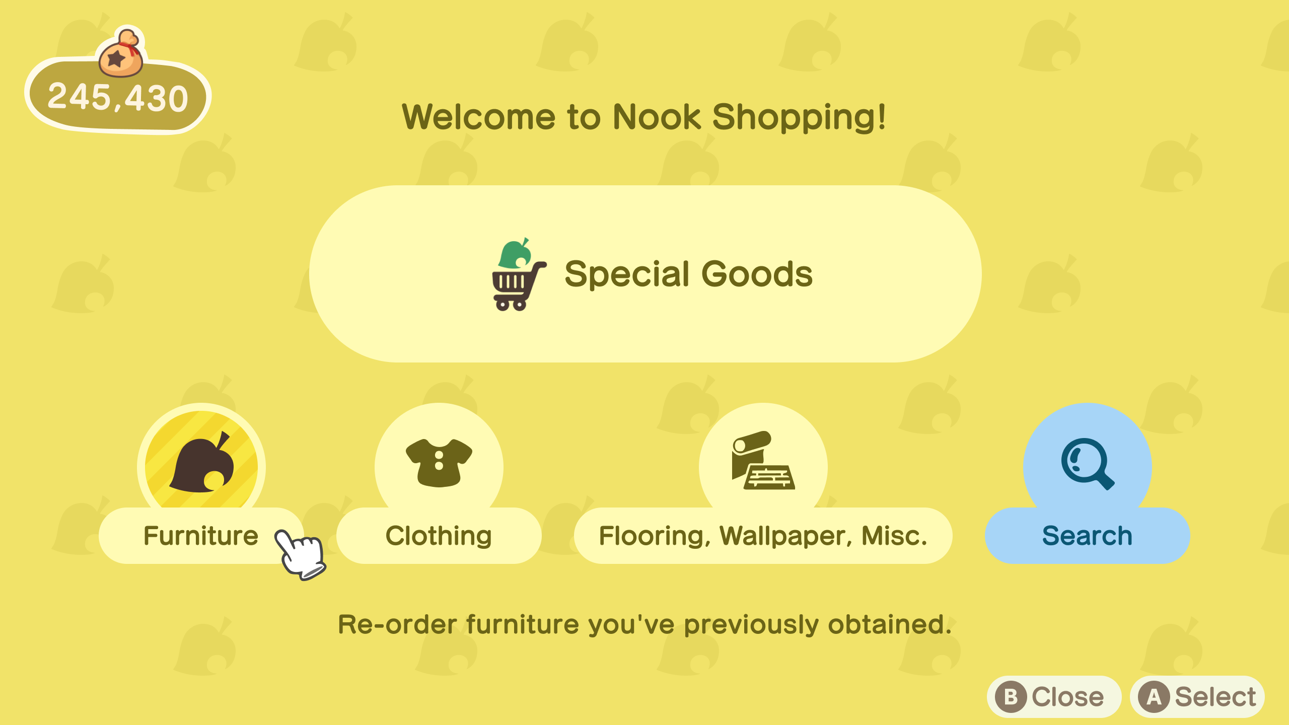
Nook Shopping
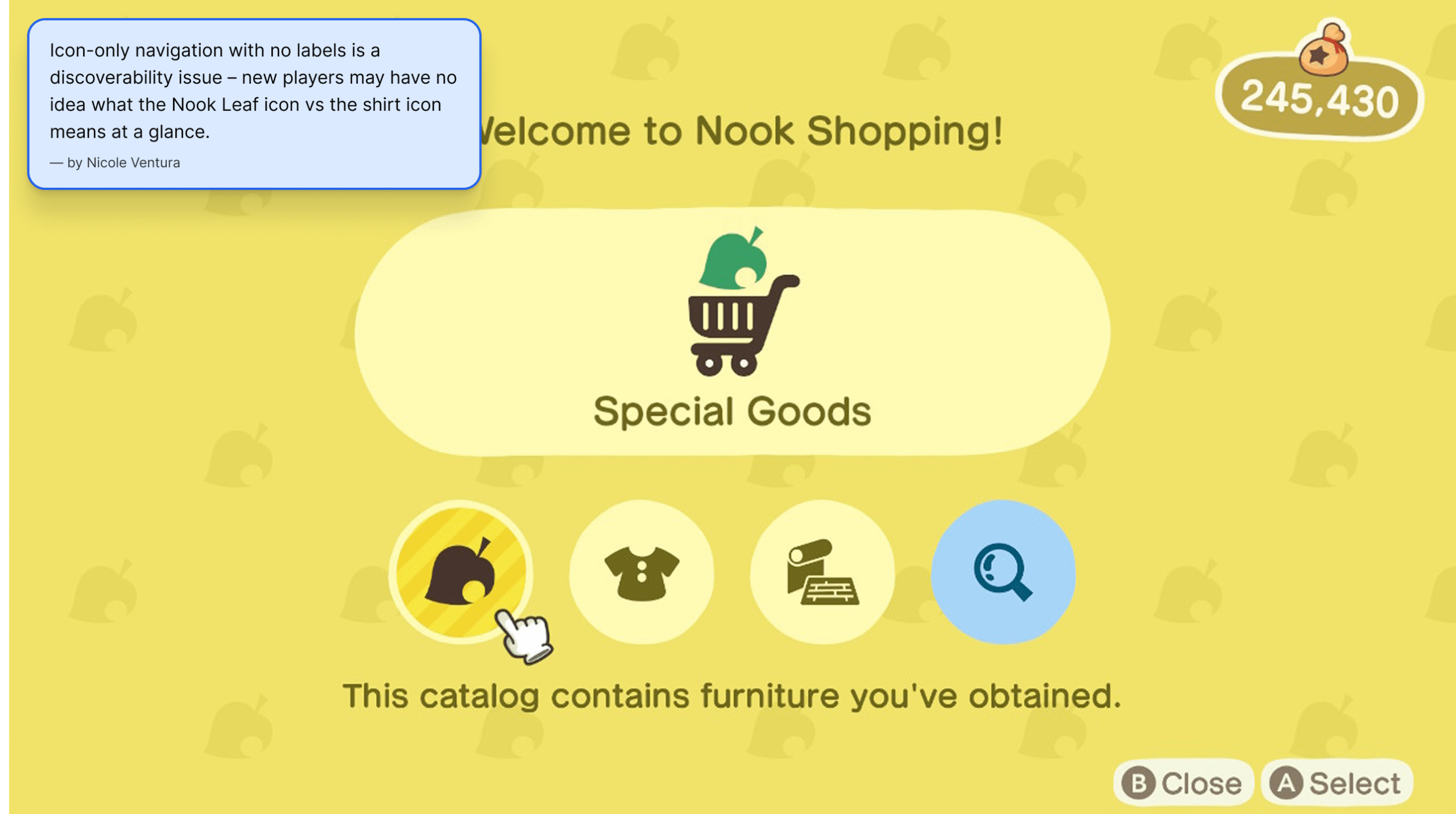
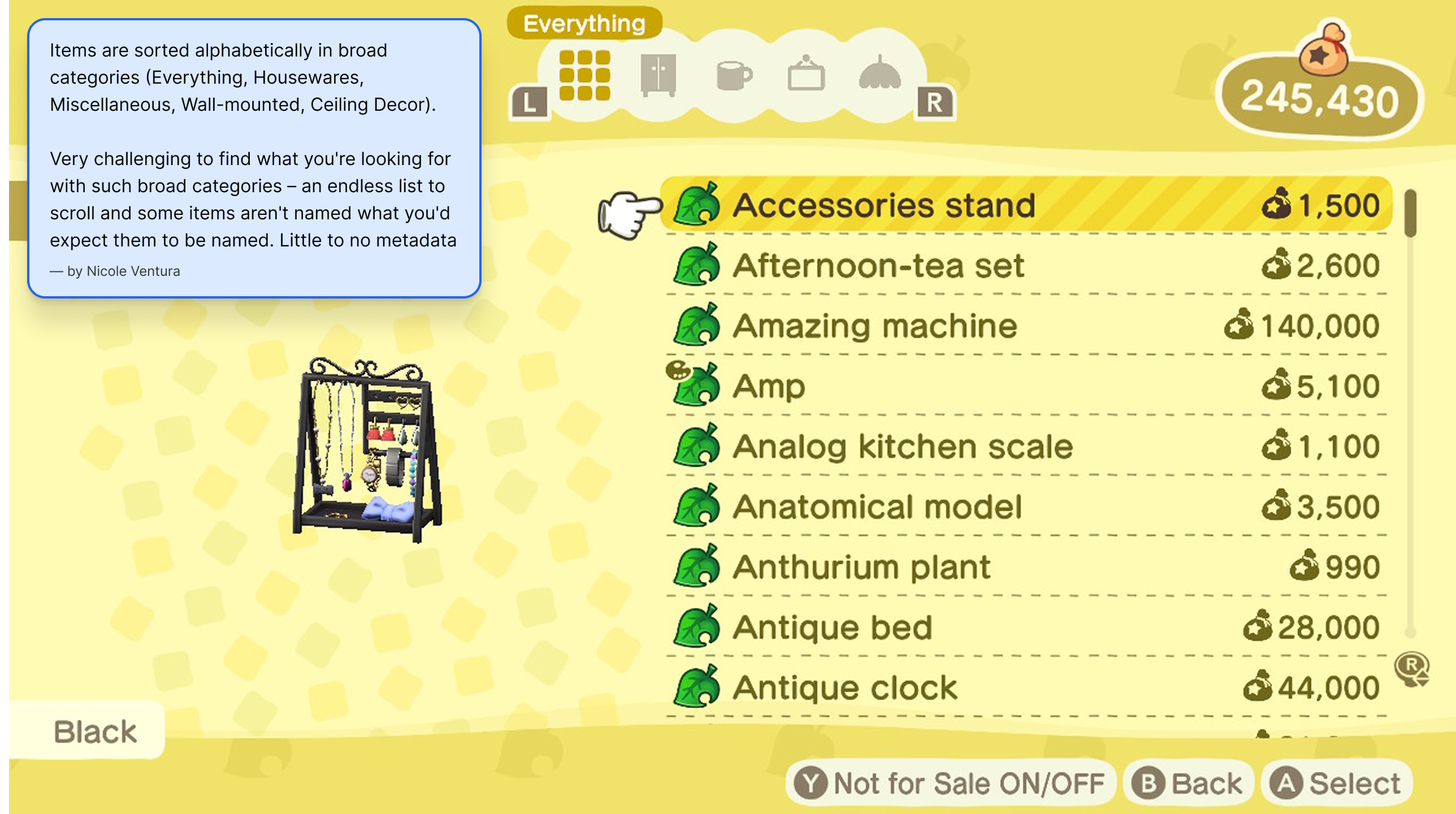
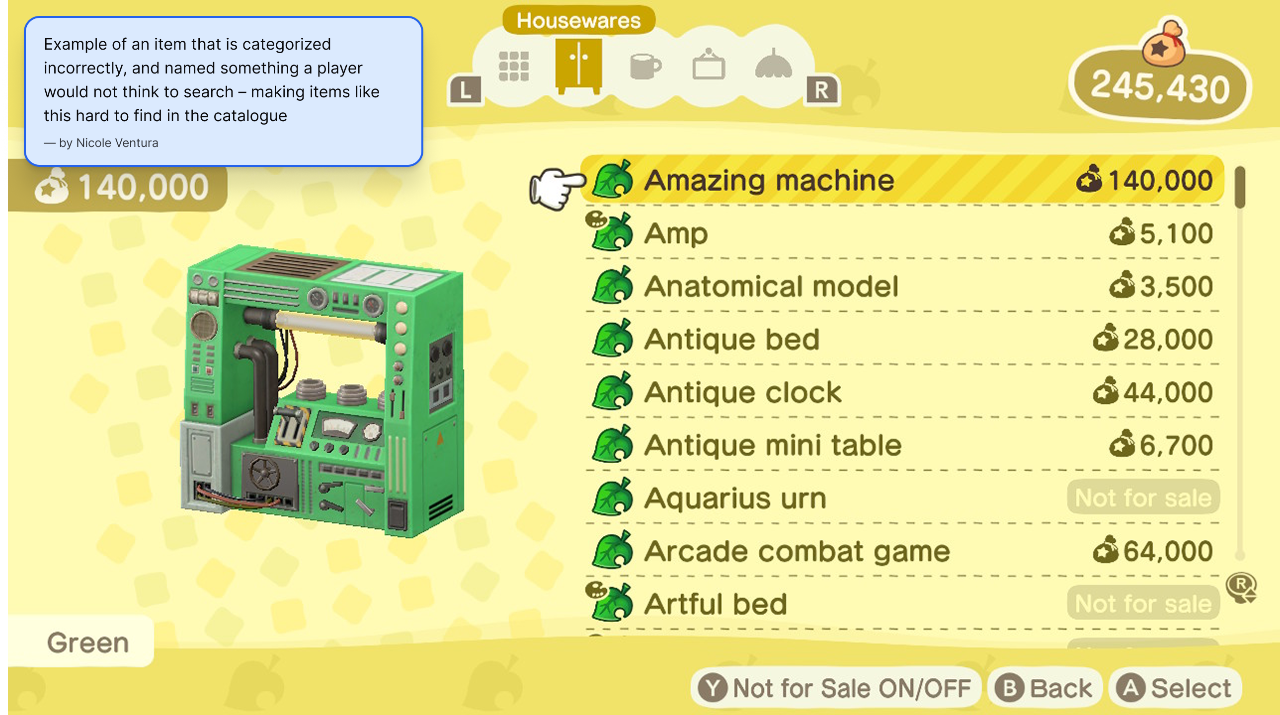
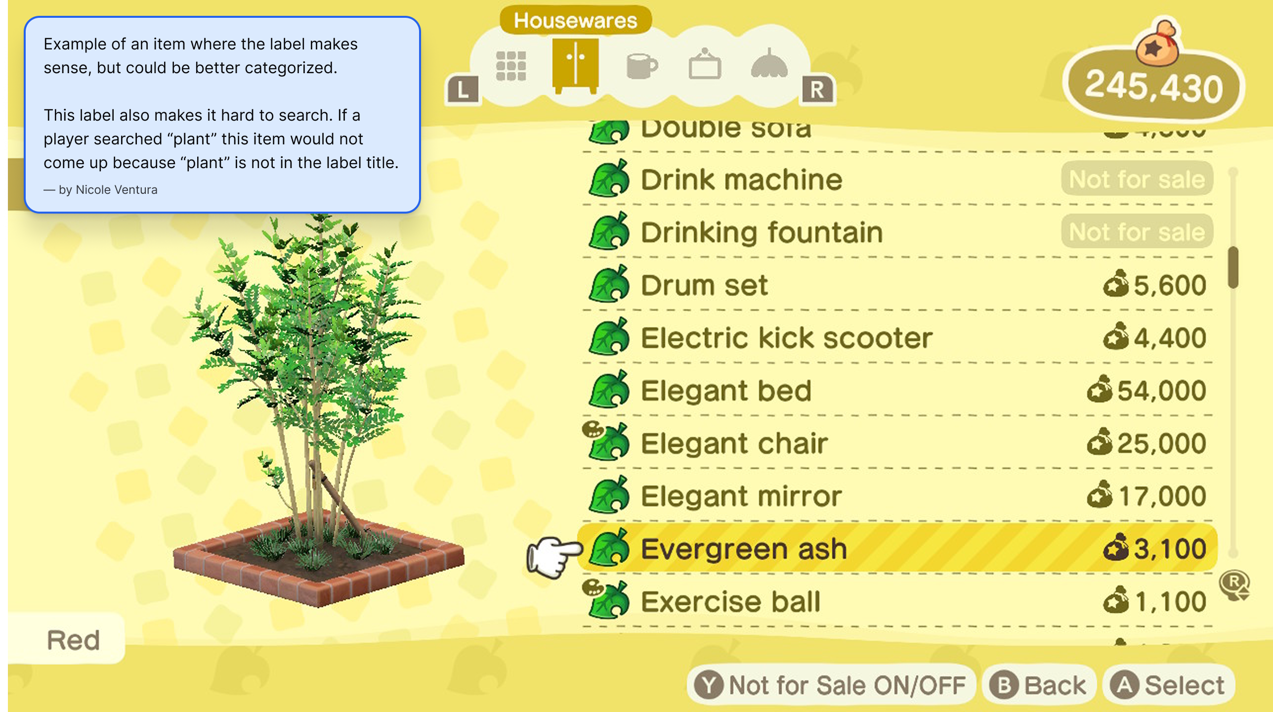
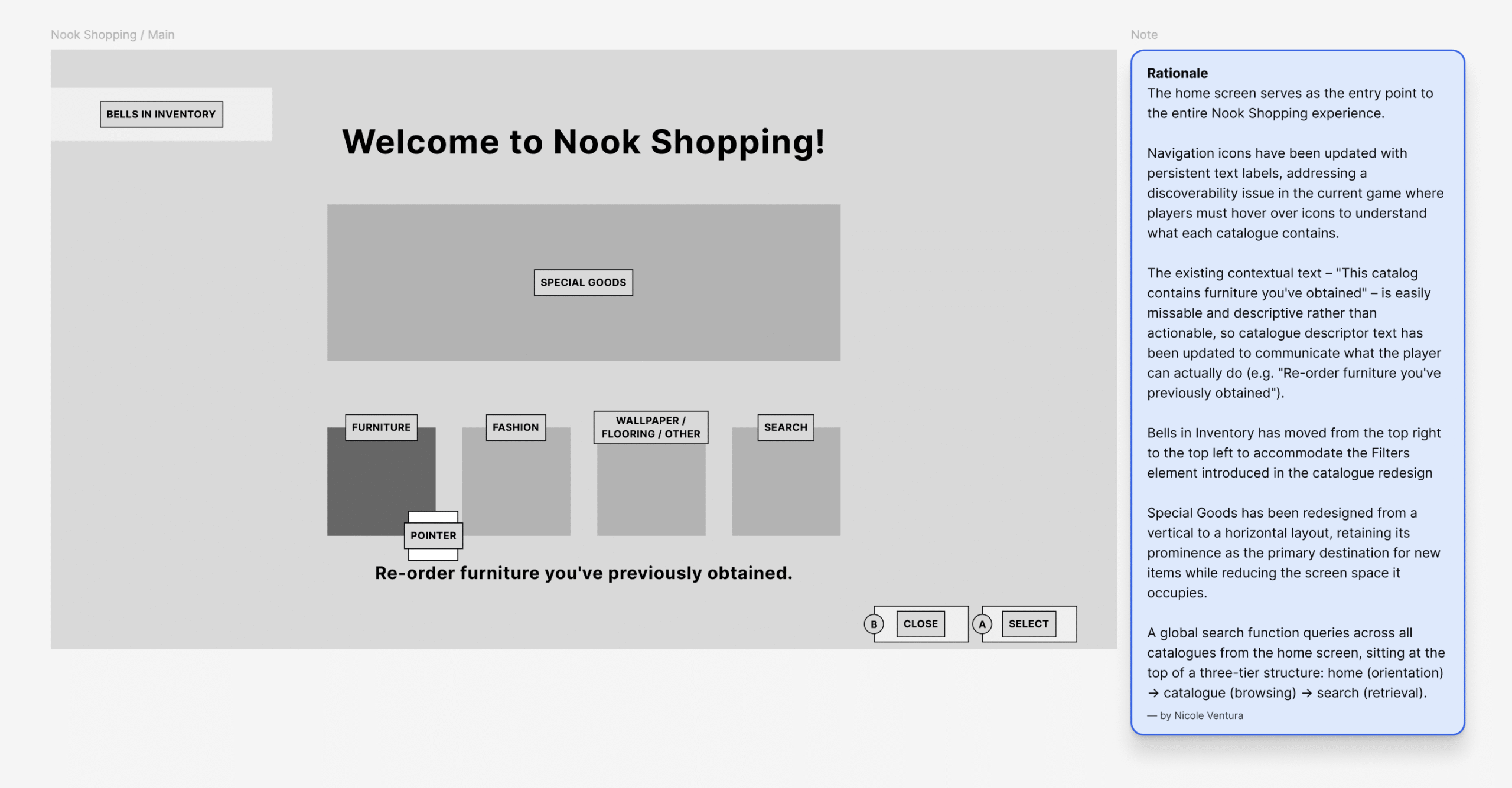
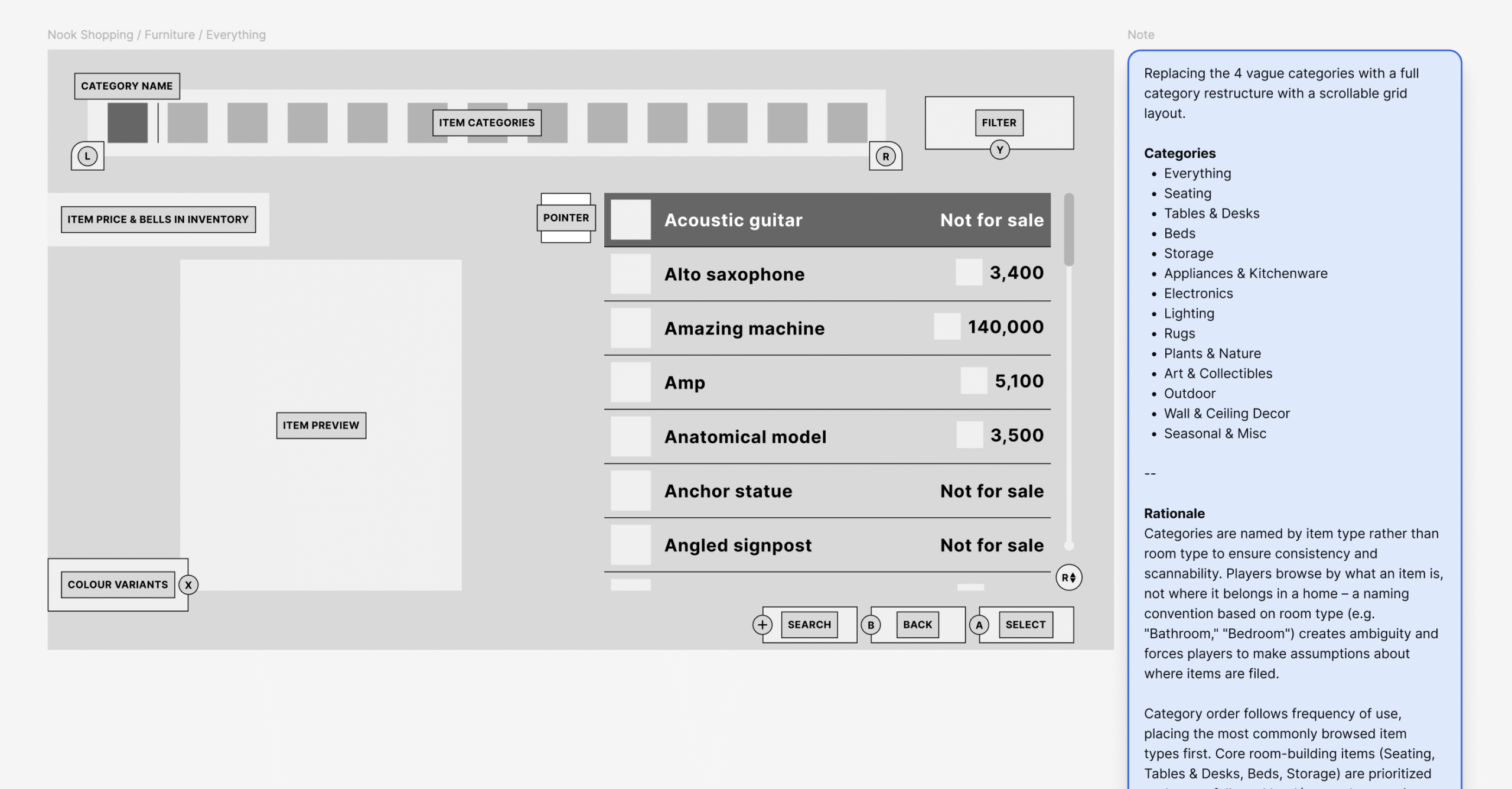
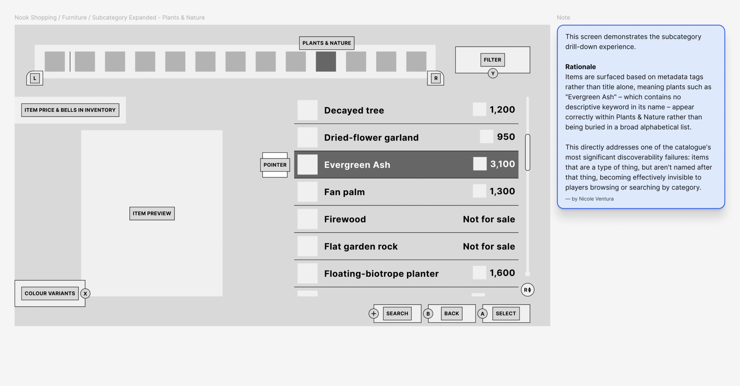
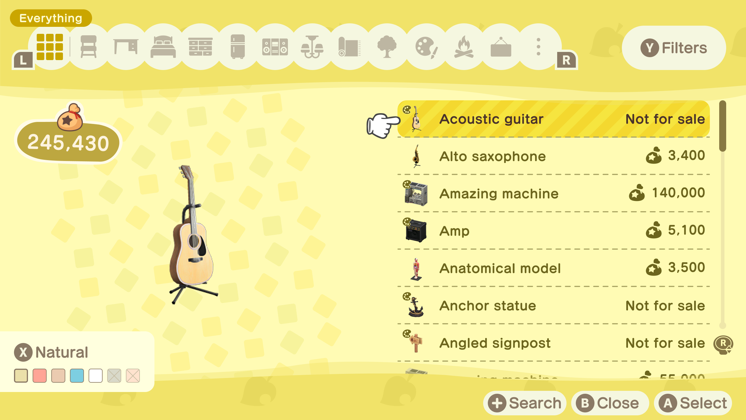
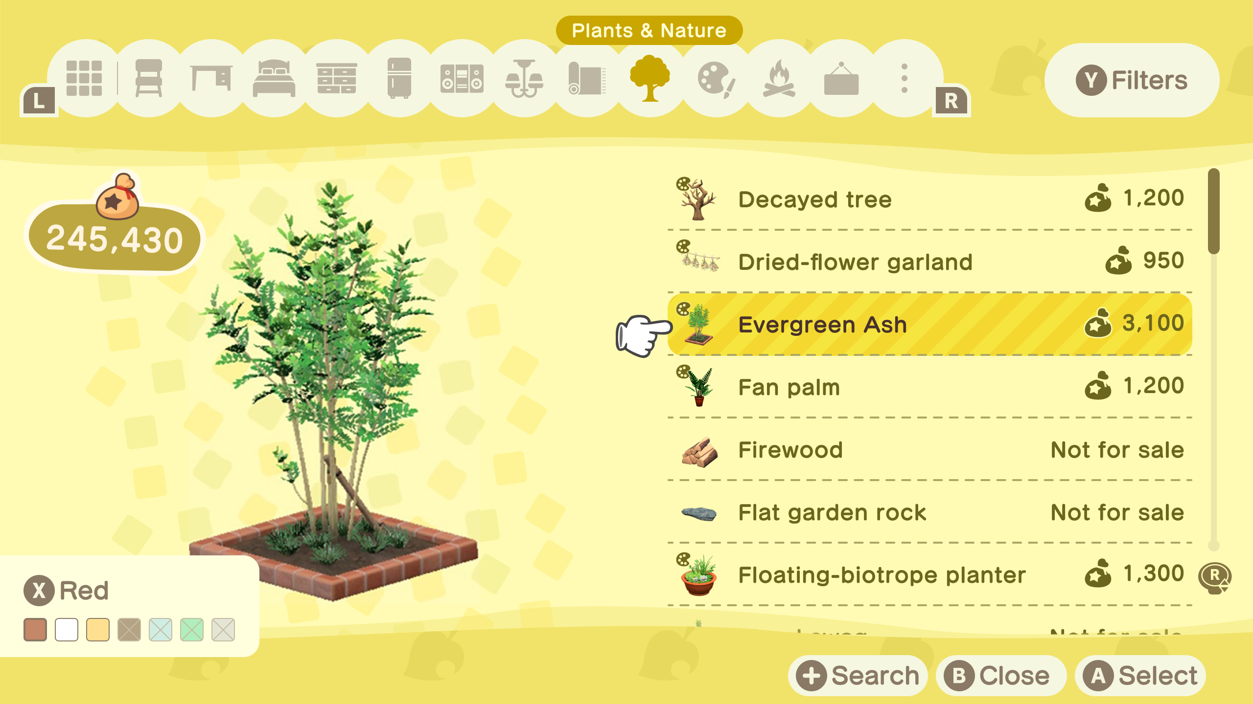
The catalogue’s core problem was discoverability – items were impossible to find because the IA was too shallow and search was too literal. The redesign introduced a deeper category structure and a metadata-aware search system that changes how players find things entirely.
Key decisions include:
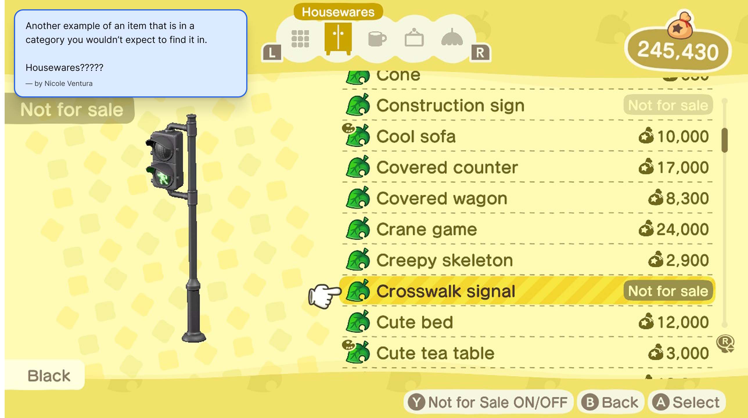
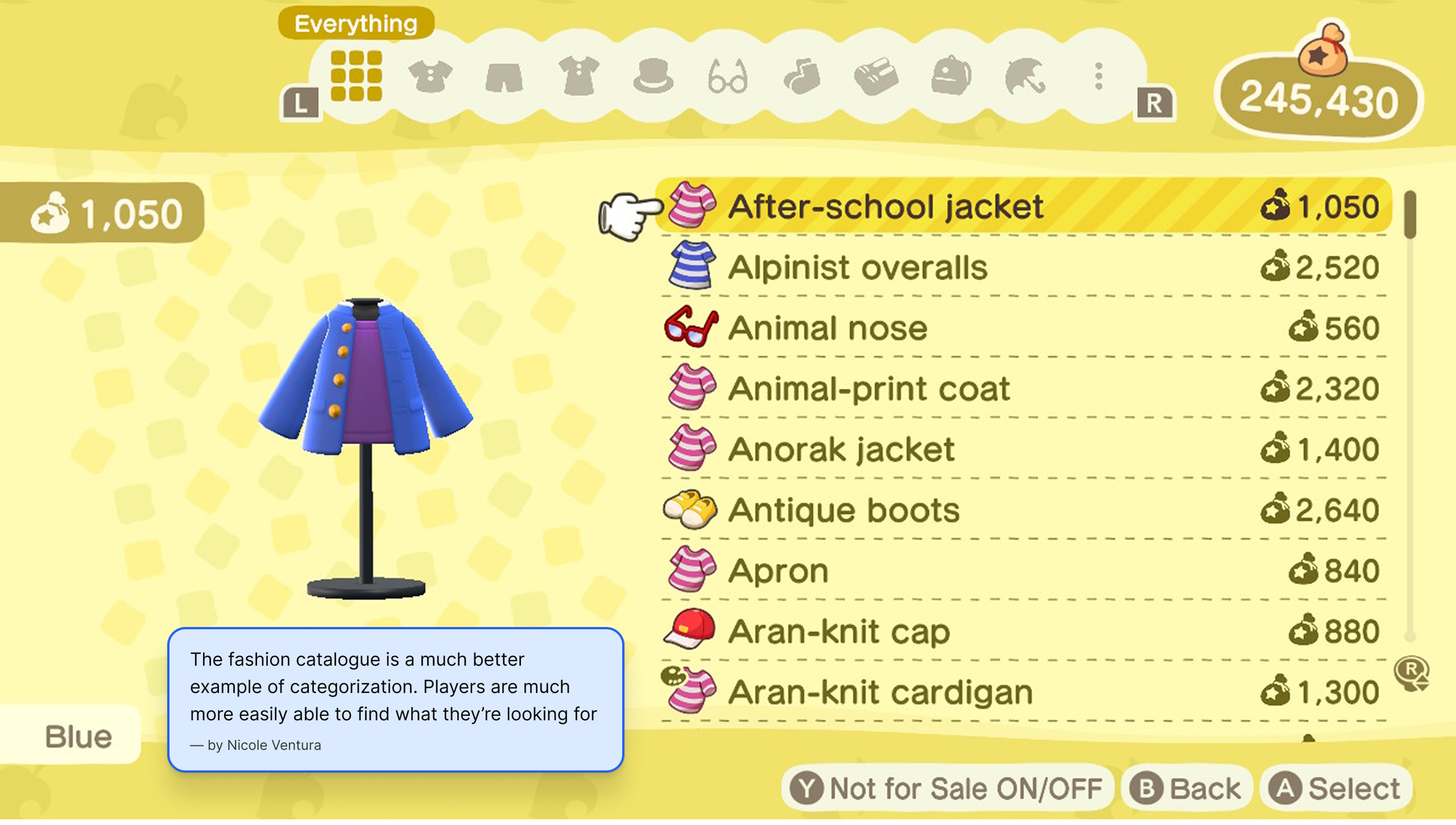
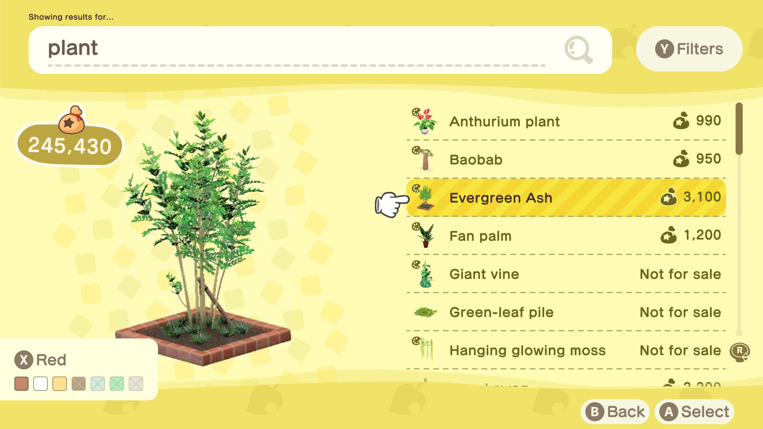
- Rebuilt the IA from 4 vague categories into 13 specific item-type categories ordered by frequency of use – named by what an item is rather than where it belongs in a home, making the catalogue instantly more scannable
- Colours panel (X button) displays all possible colour variations for any selected item – unobtained colours shown but unselectable, giving players full awareness of what exists without implying availability
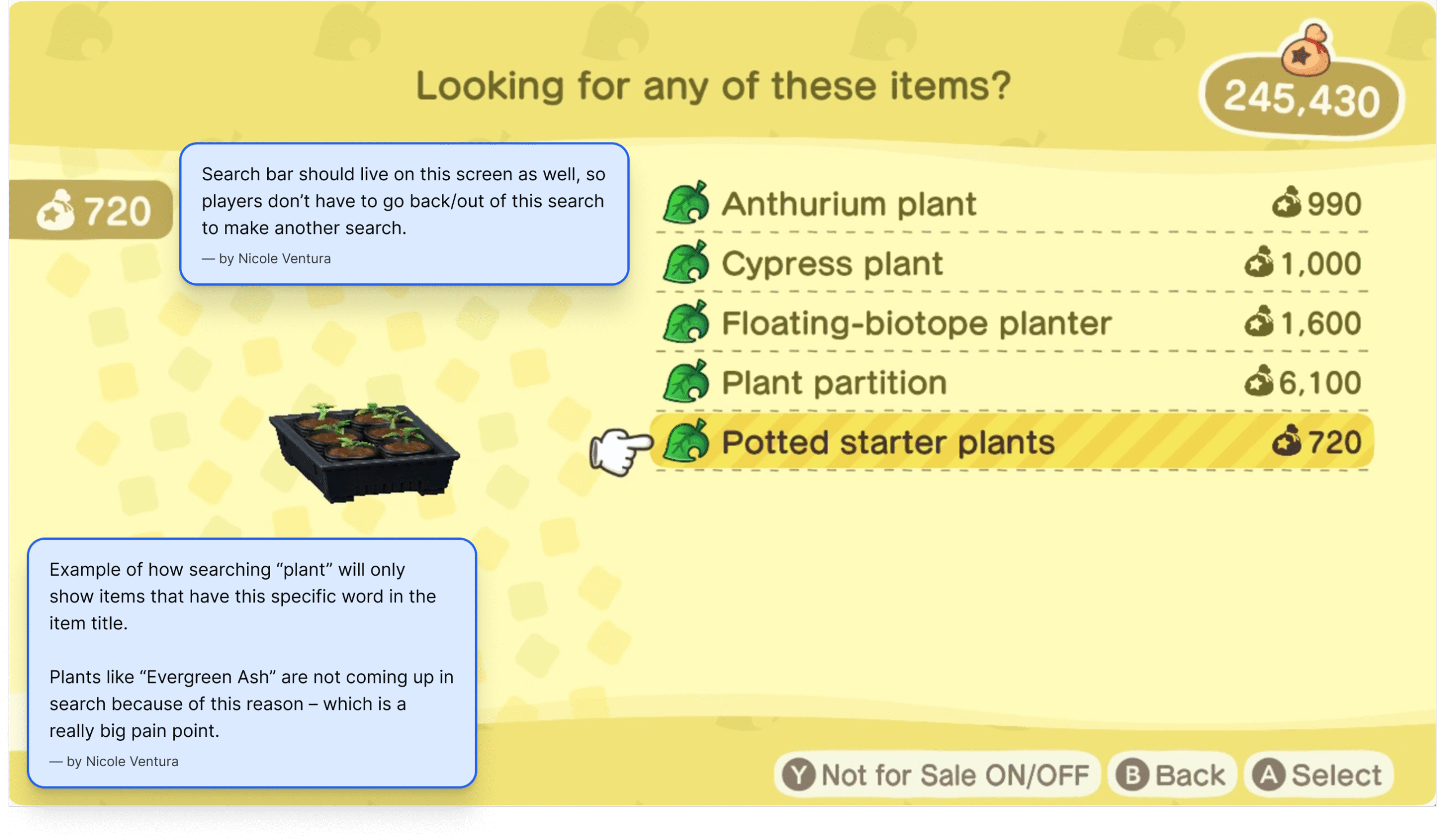
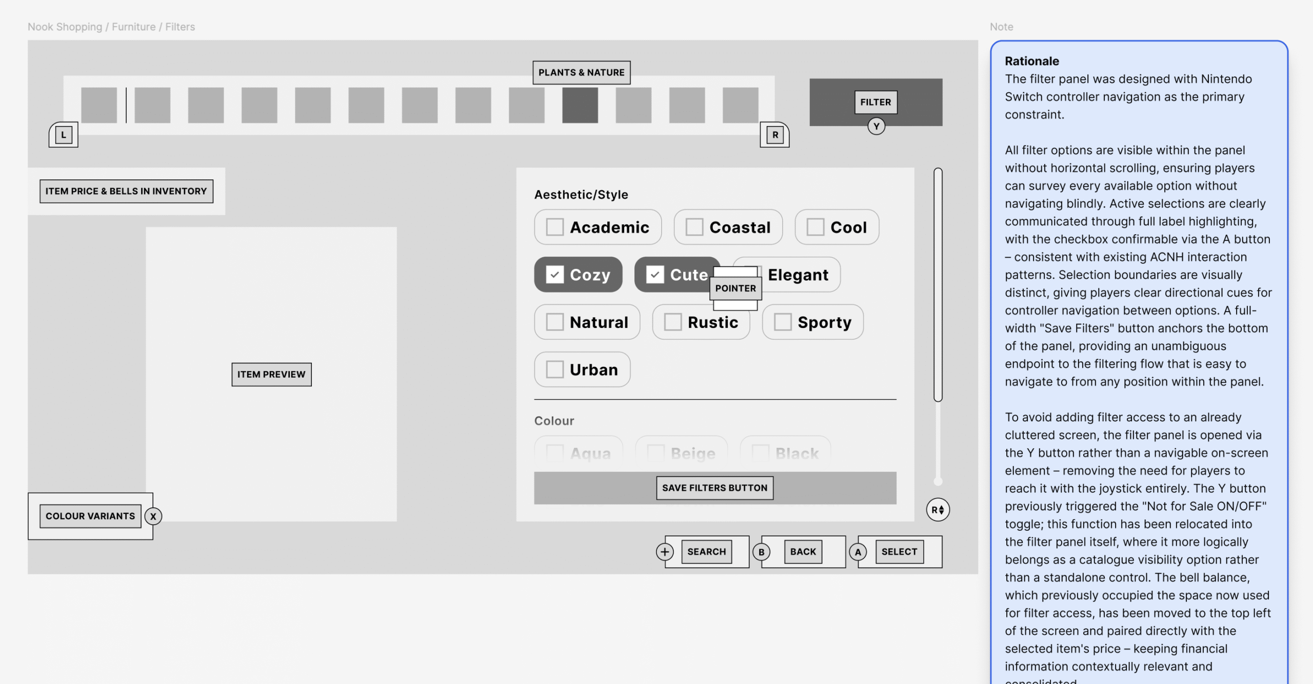
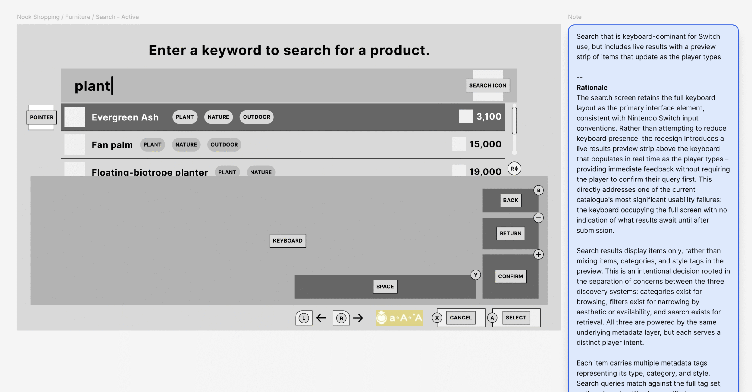
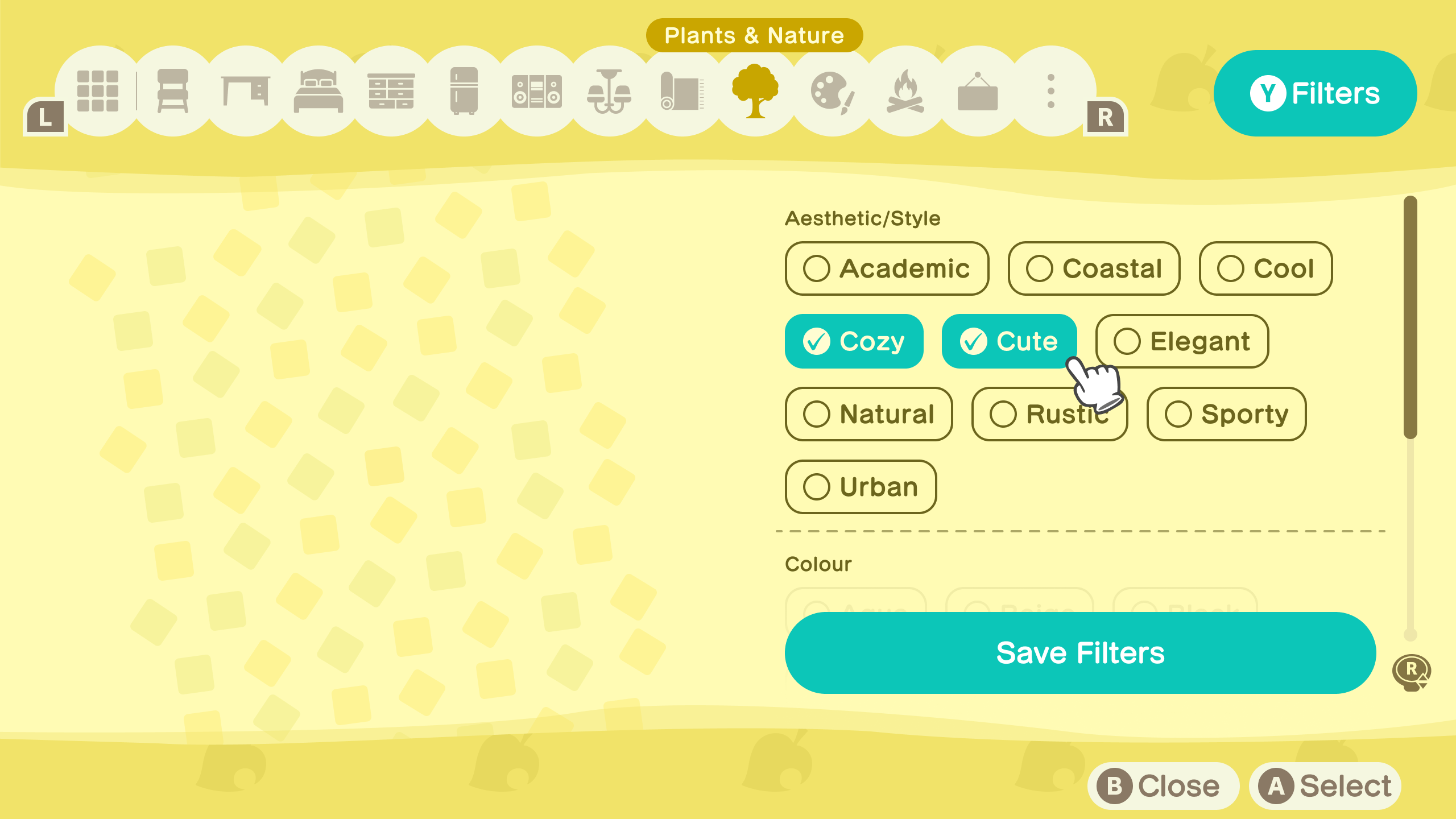
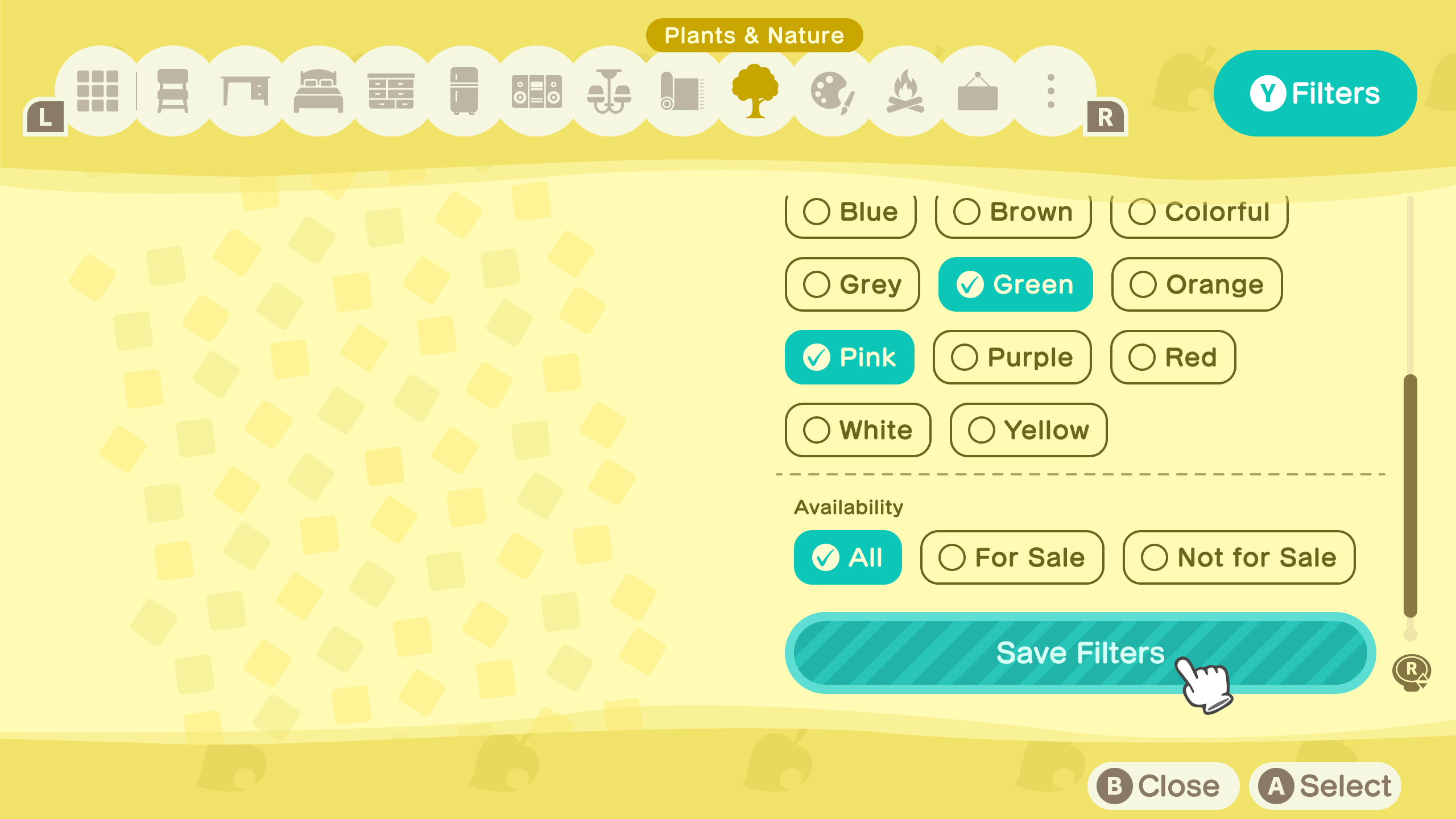
- Introduced a Filters panel (Y button) and contextual catalogue search (+ button) as dedicated controller shortcuts – no joystick navigation required for either, keeping the browsing flow uninterrupted. The Y button previously triggered “Not for Sale ON/OFF” – this has been relocated into the filter panel where it more logically belongs
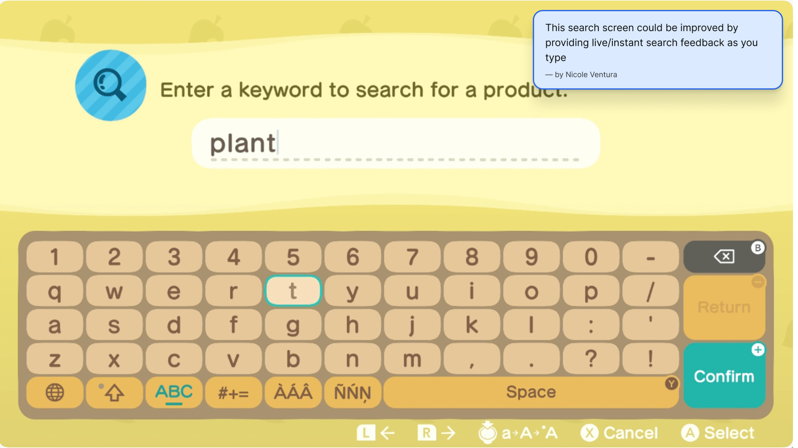
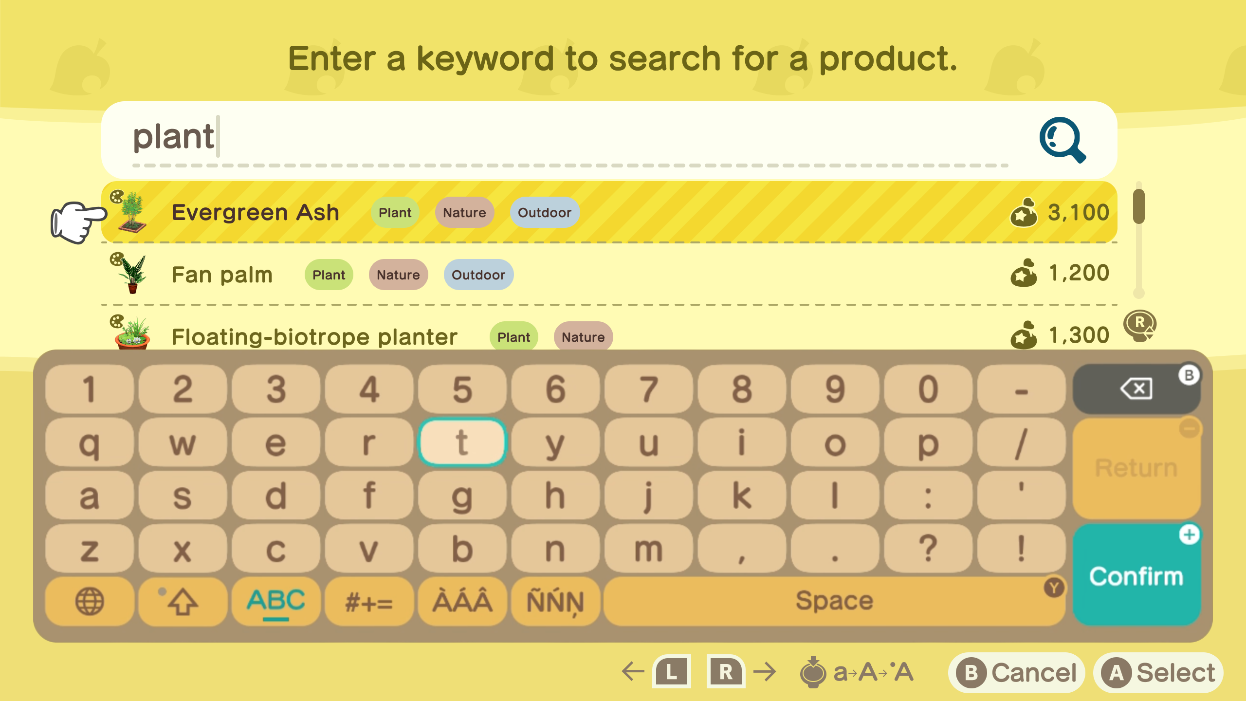
- Introduced a live search preview strip above the keyboard that populates in real time – powered by a metadata tagging system that returns items based on what they are, not just what they’re named. Searching “plant” surfaces Evergreen Ash, Baobab, and Titan Arum despite none containing the word in their name

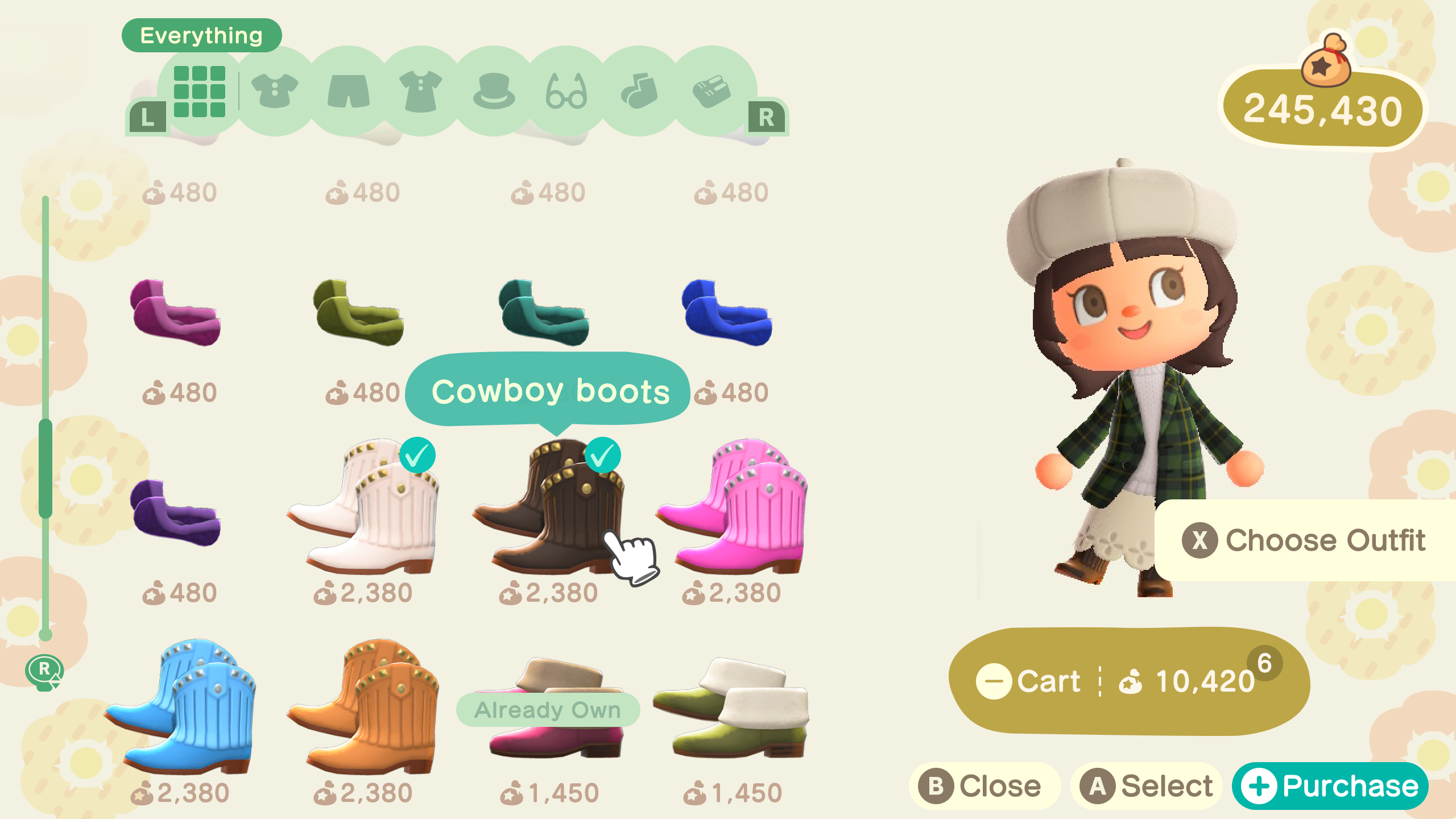
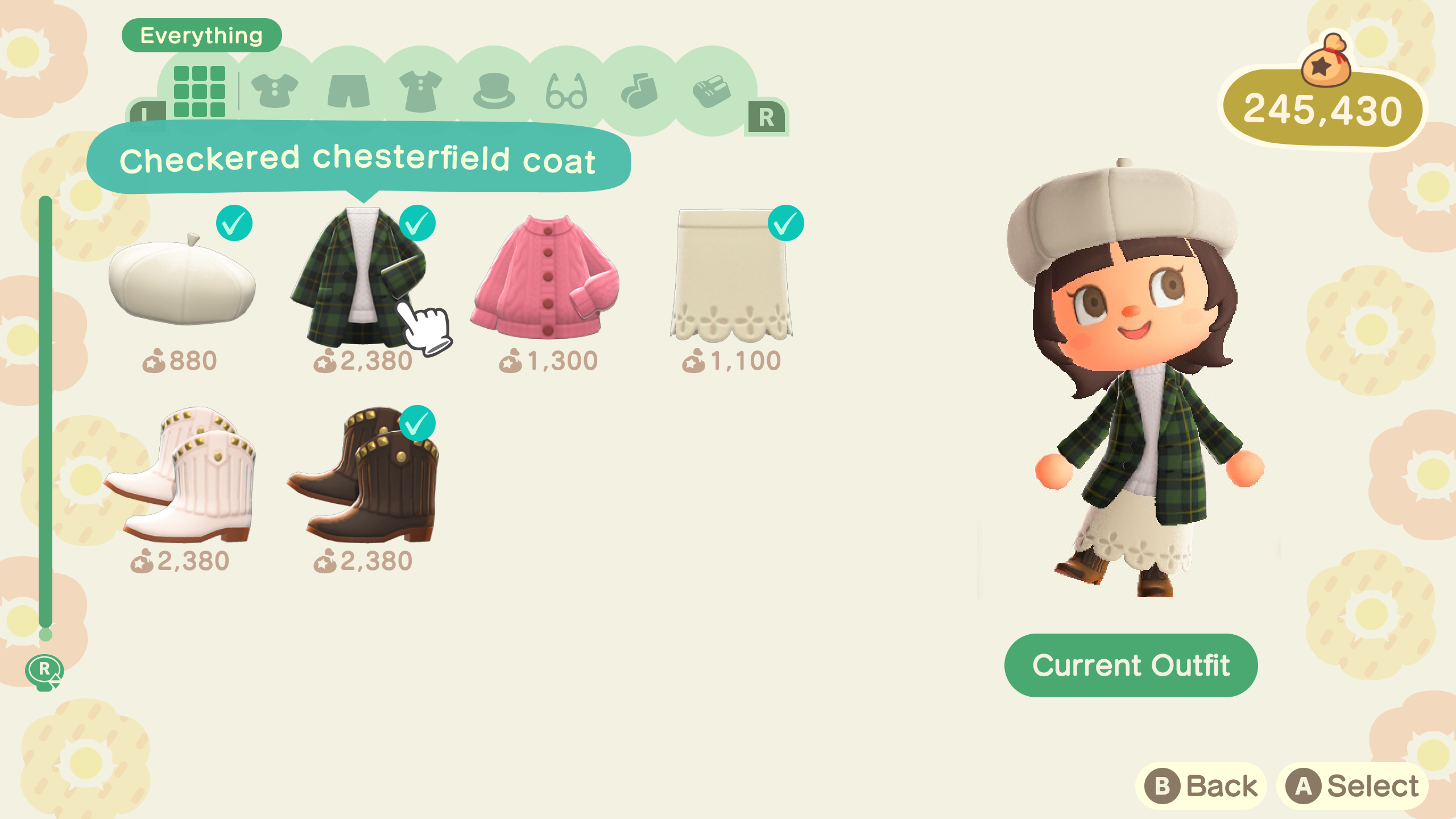
Able Sisters
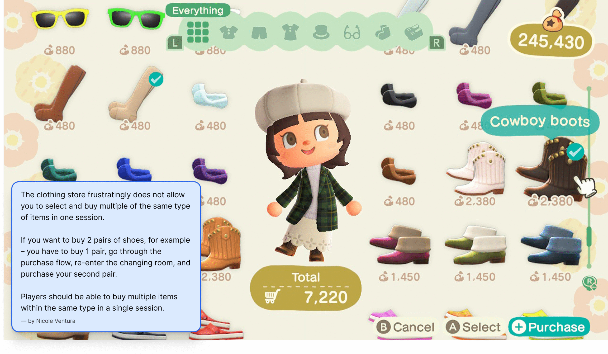
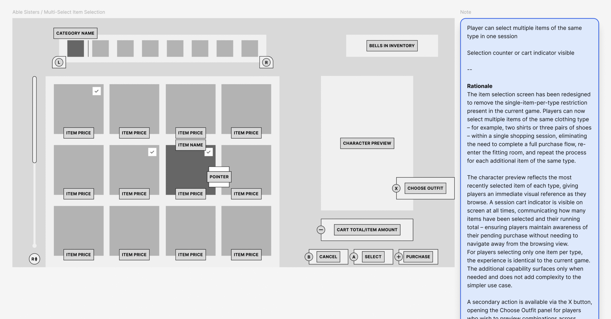
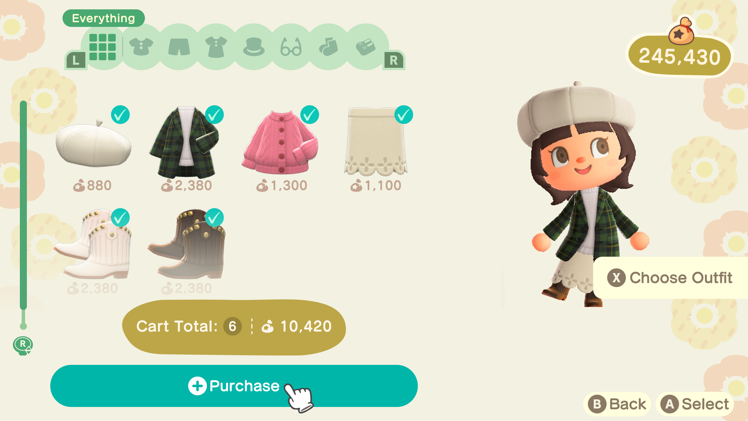
The clothing store’s problems were about control – players couldn’t buy what they wanted in one session, and the purchase flow asked questions after the fact instead of putting players in control upfront.
Key decisions include:
- Removed the single-item-per-type restriction, allowing players to select multiple items of the same clothing type in a single session – eliminating the need to complete a full purchase flow and re-enter the fitting room for each additional item
- Added an “Already Own” label to items the player already owns in their inventory or home storage – removing the friction of having to remember or manually check before purchasing, while still allowing players to rebuy items intentionally for gifting
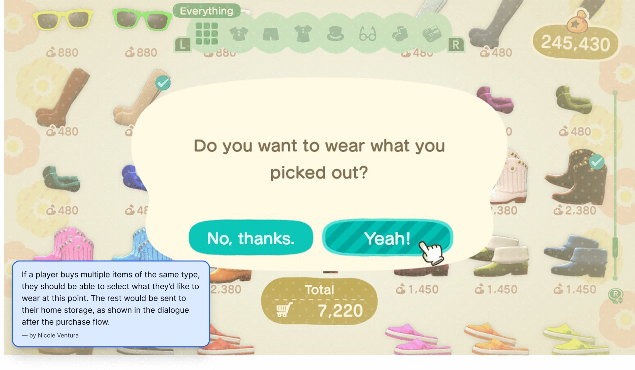
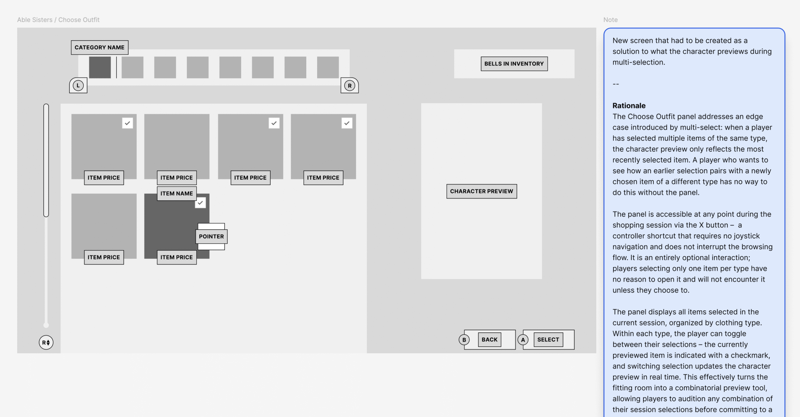
- Introduced a Choose Outfit panel (X button) to solve the edge case of previewing combinations across multiple selections of different types – players can toggle between selections and see updates on the character preview in real time before committing
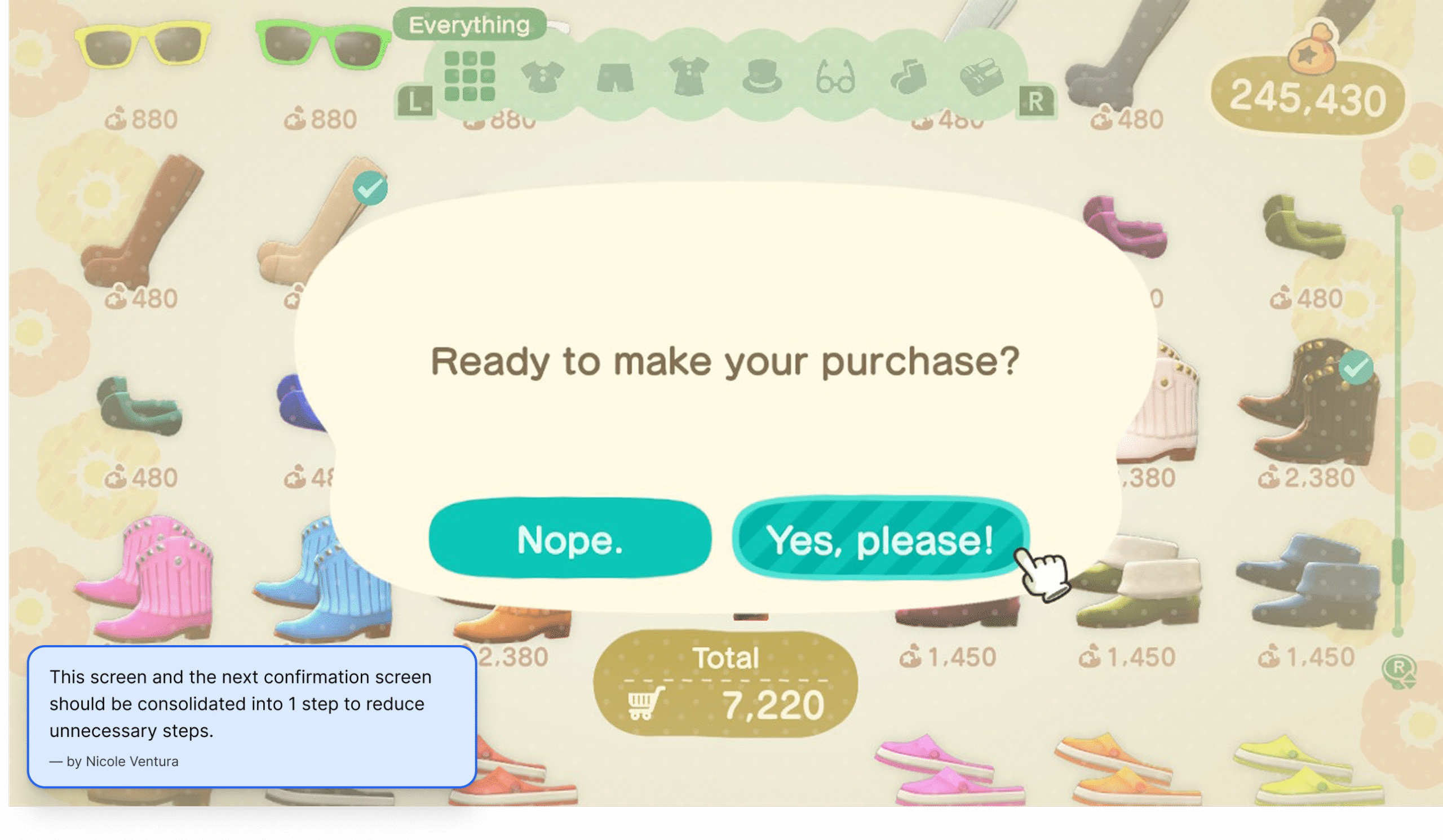
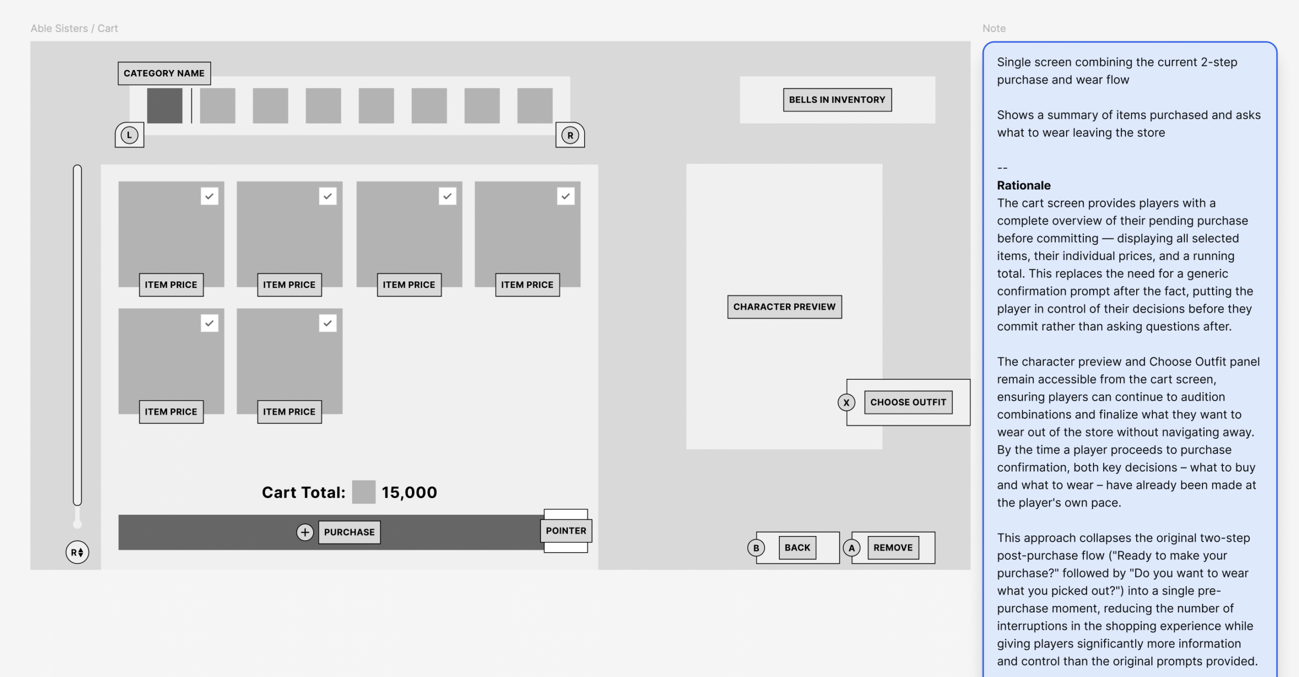
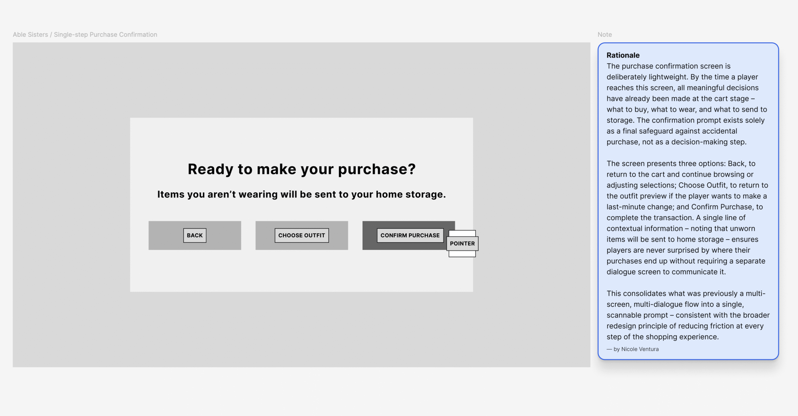
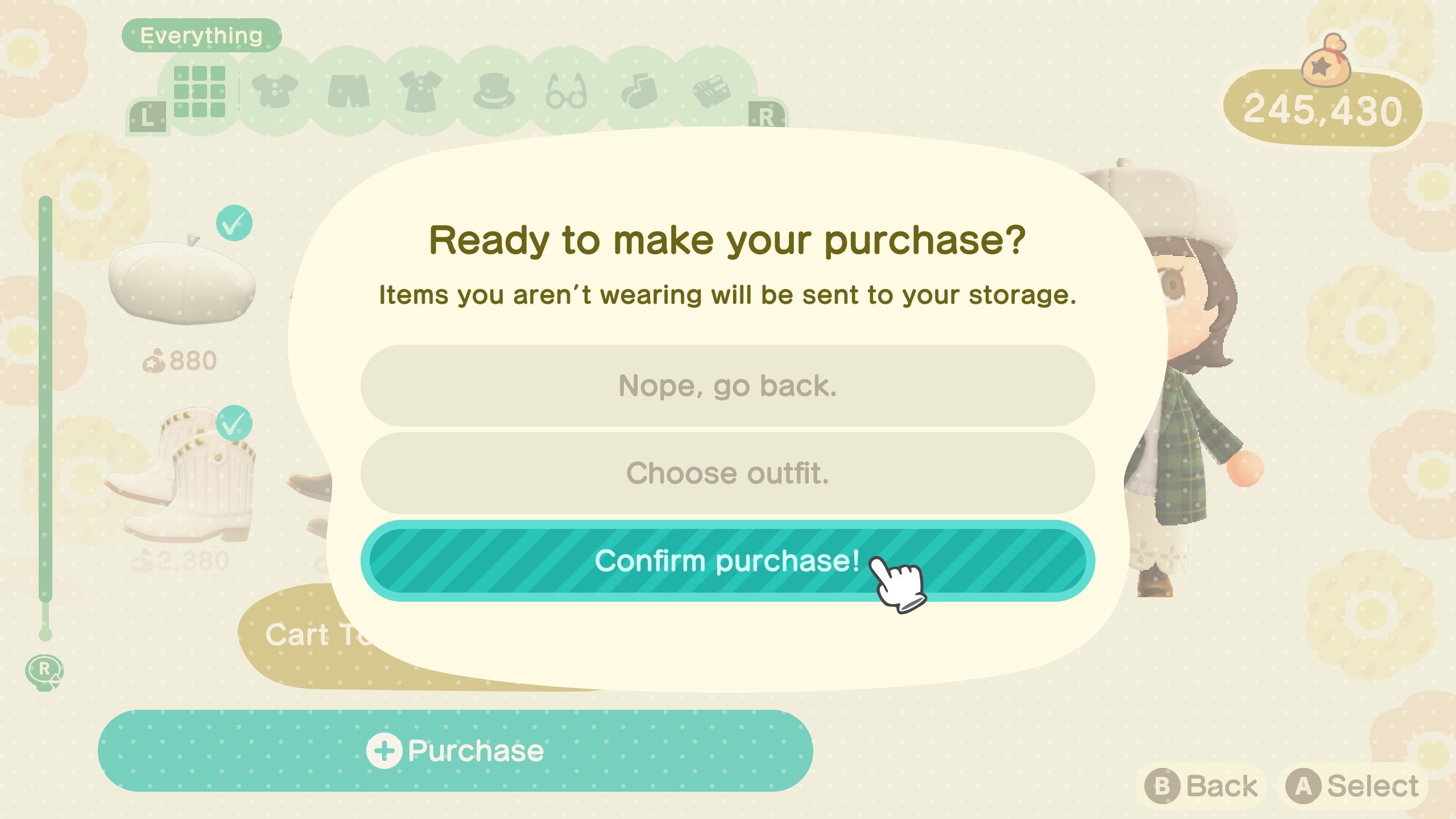
- Replaced the two-step post-purchase confirmation flow with a cart screen and a single lightweight confirmation prompt – all decisions made before committing, not after
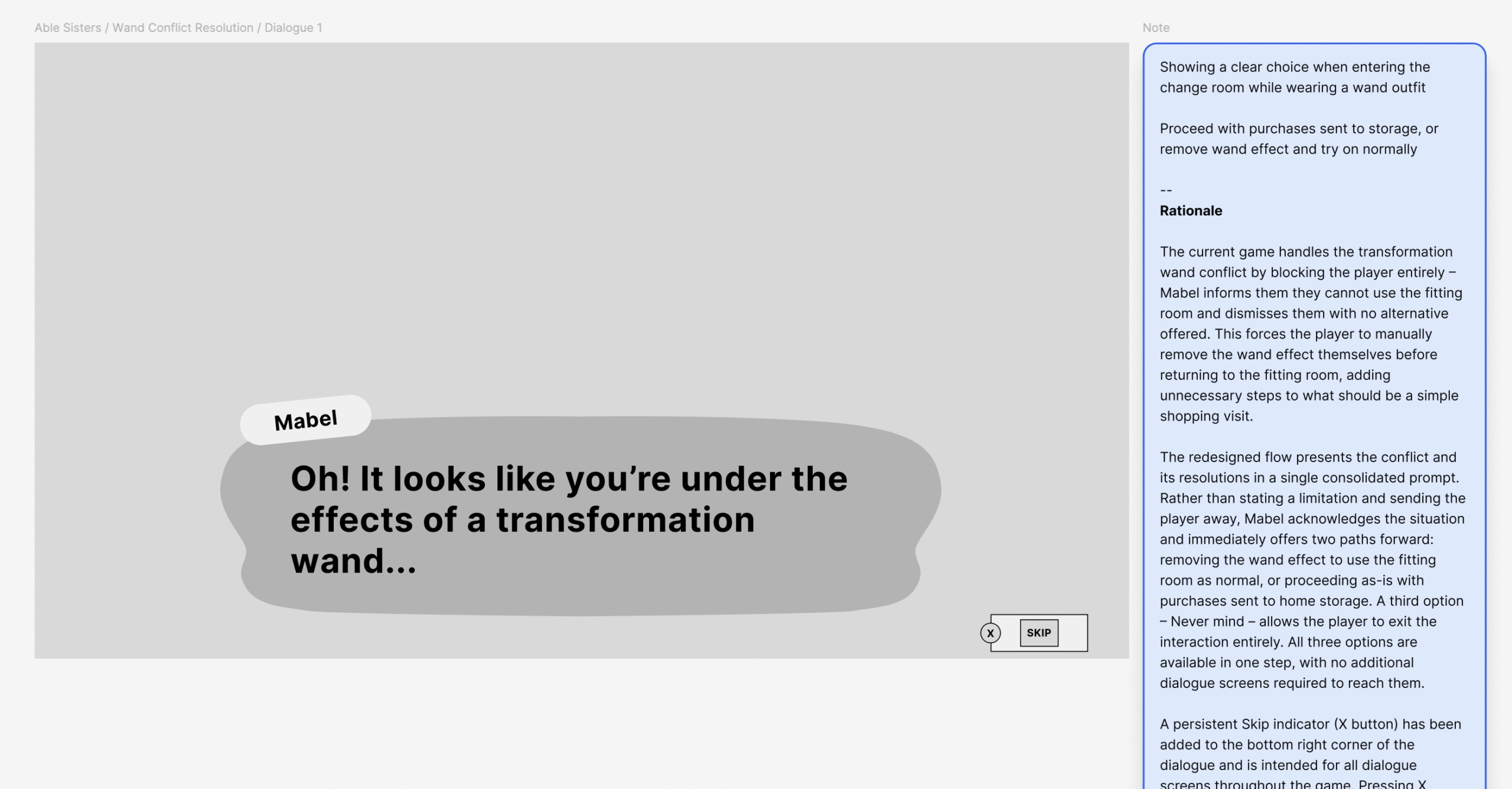
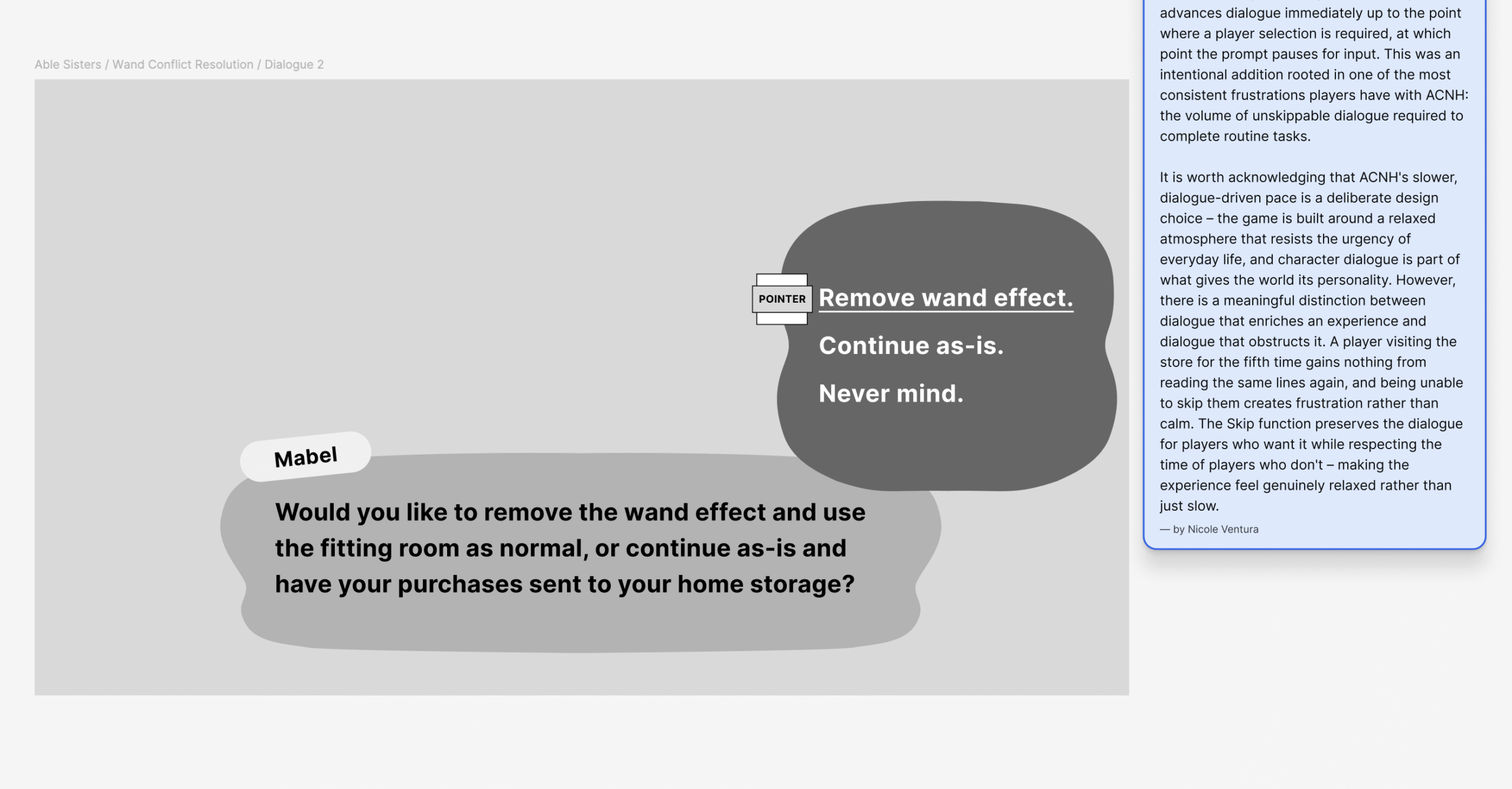
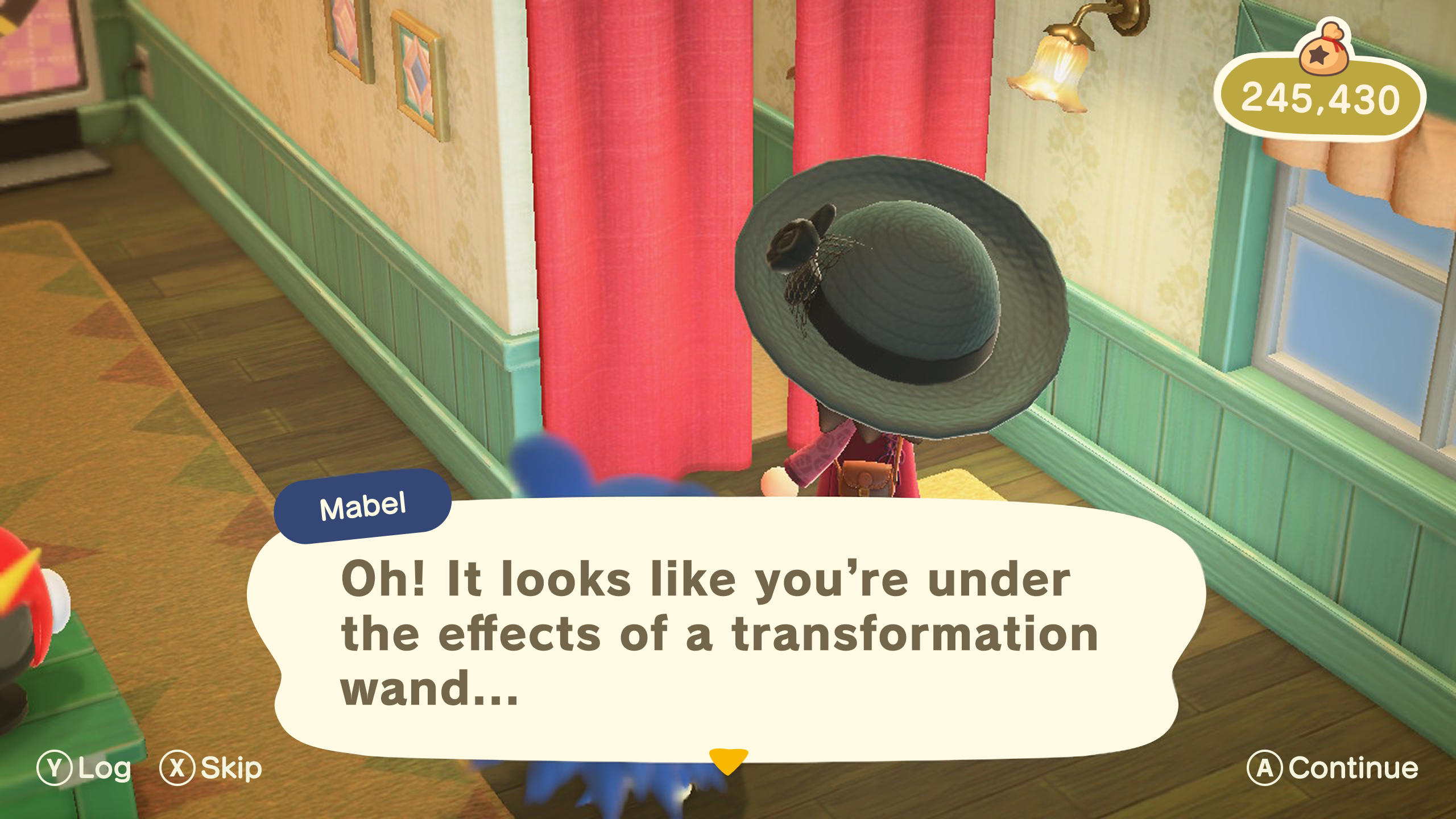
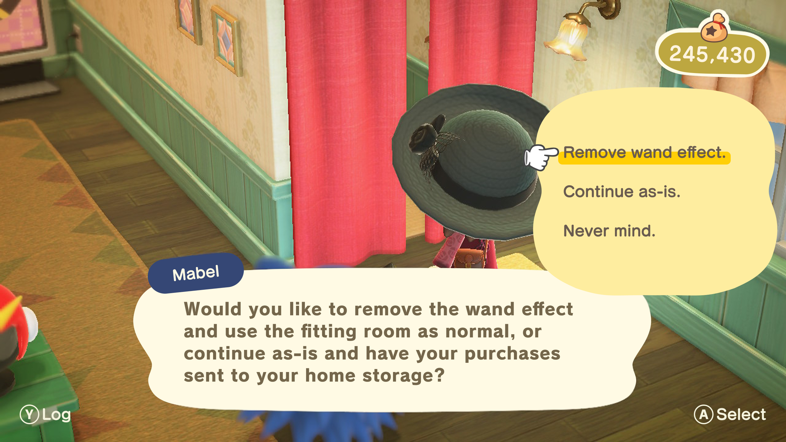
- Resolved the transformation wand conflict by turning a dead end into a proactive choice – players are offered two clear paths forward instead of being blocked entirely
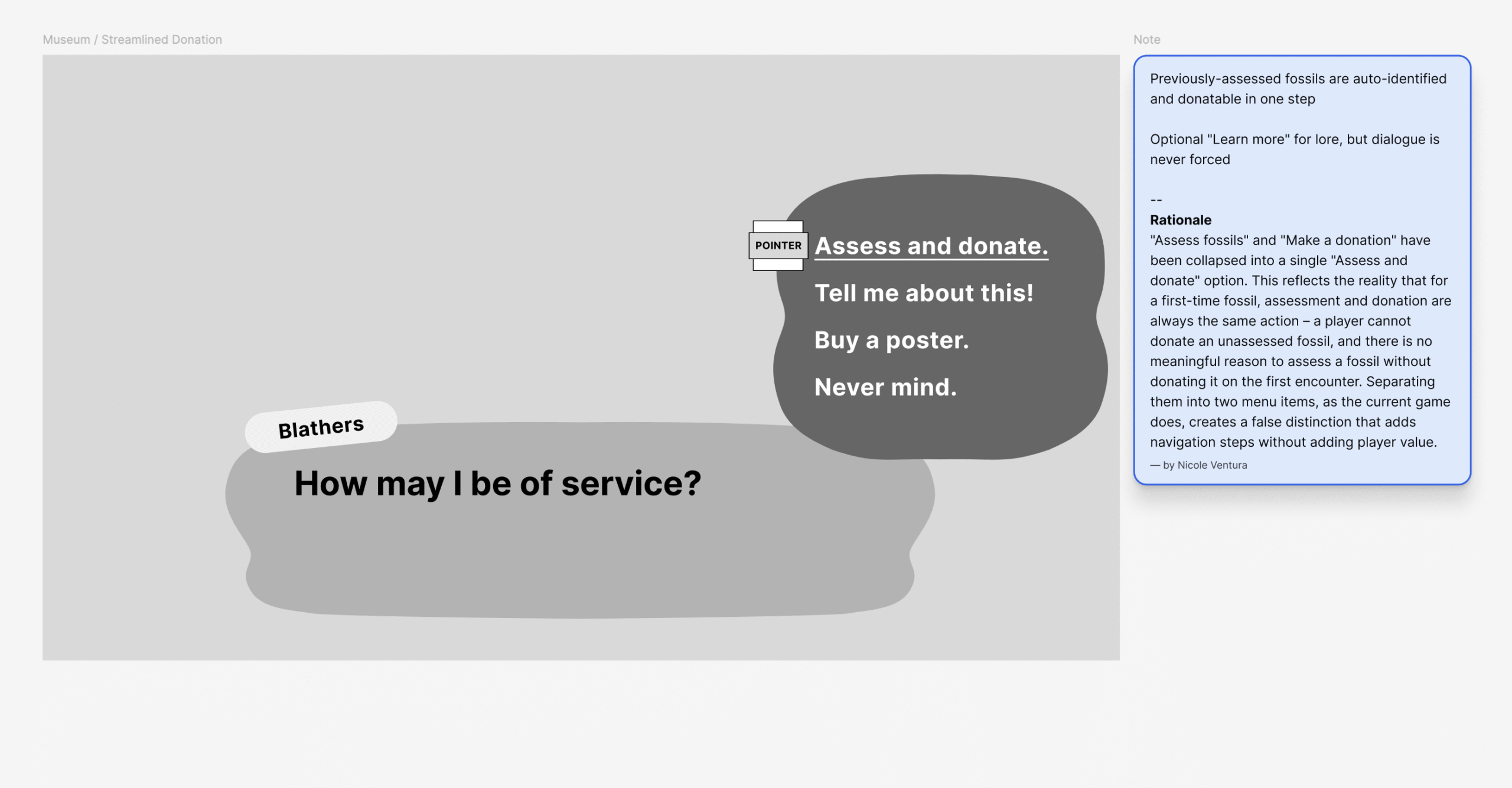
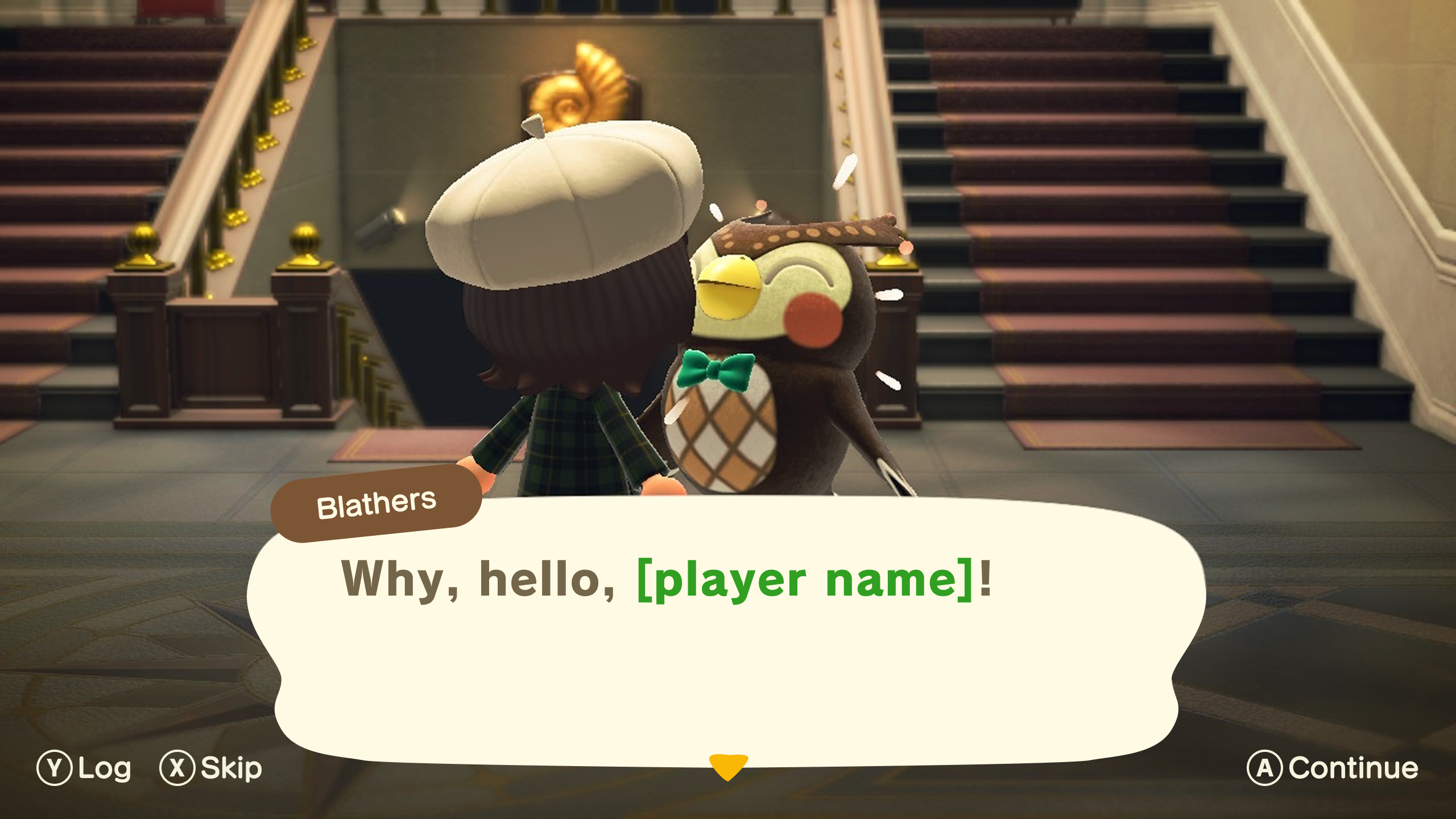
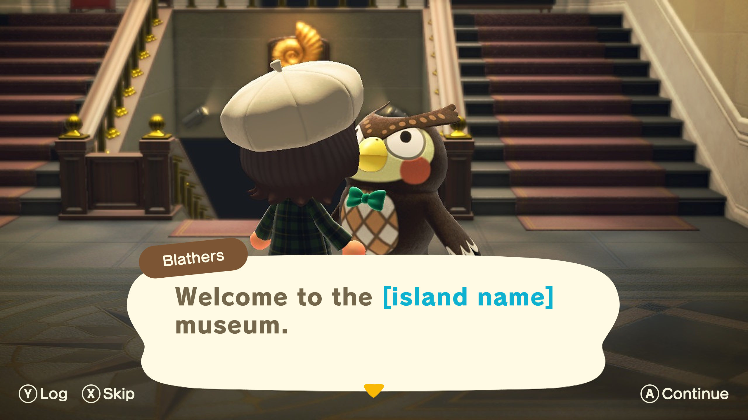
Museum
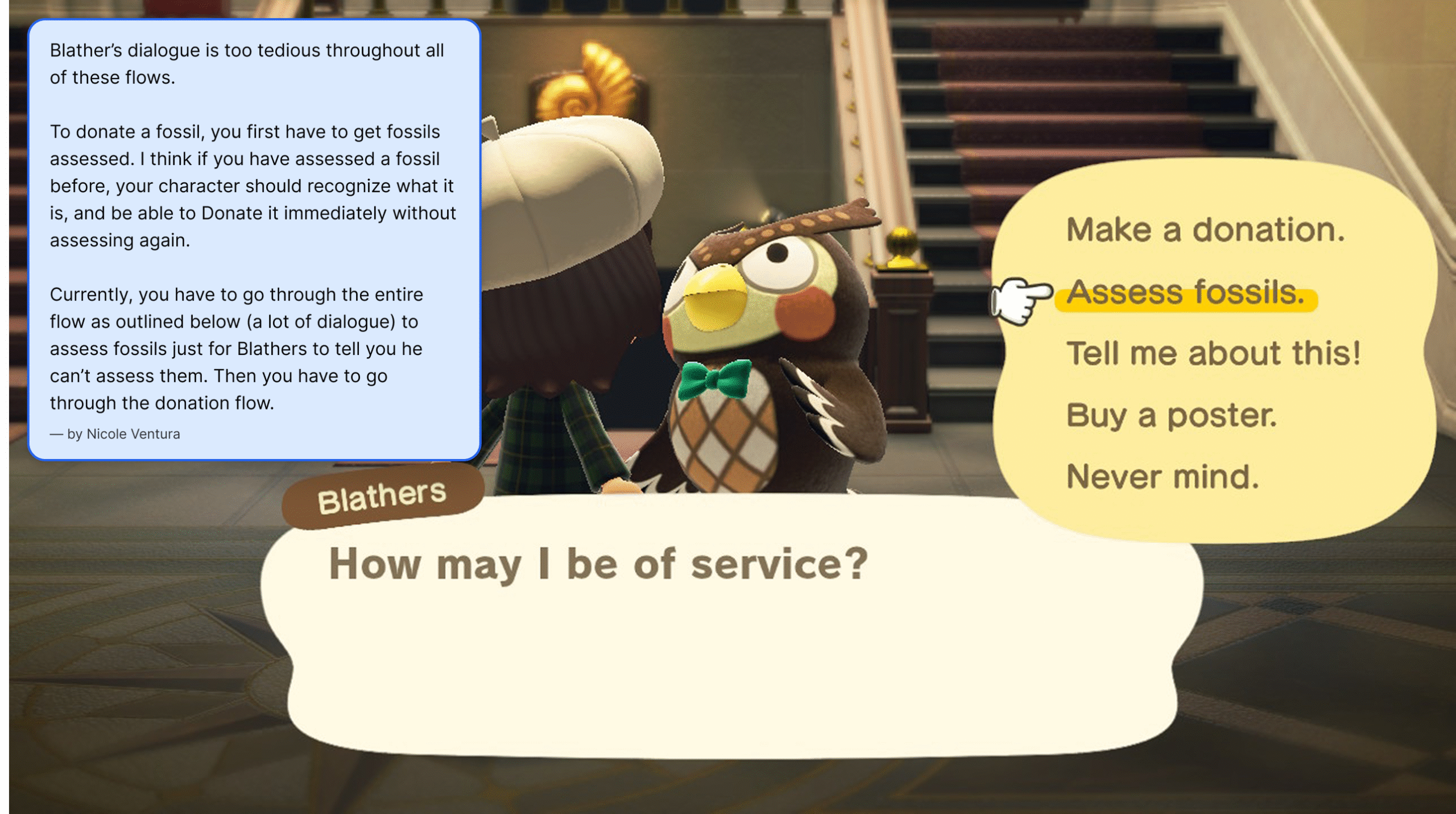
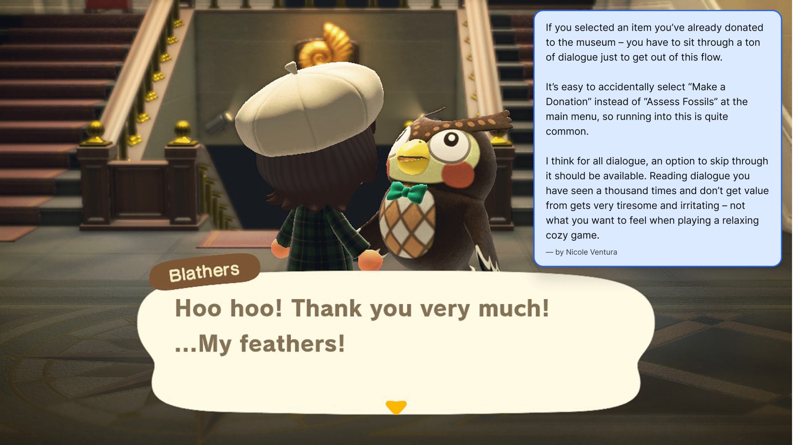
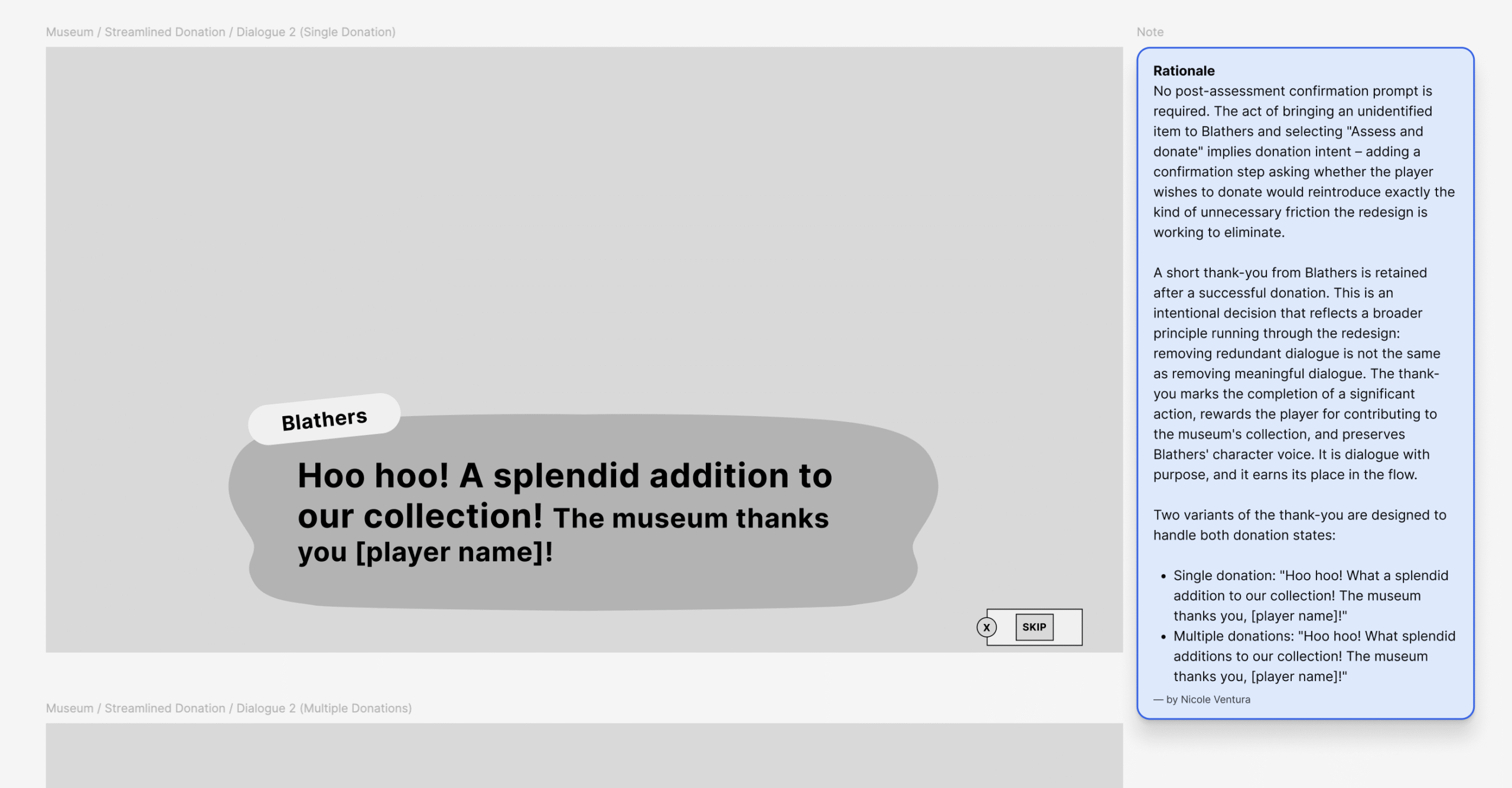
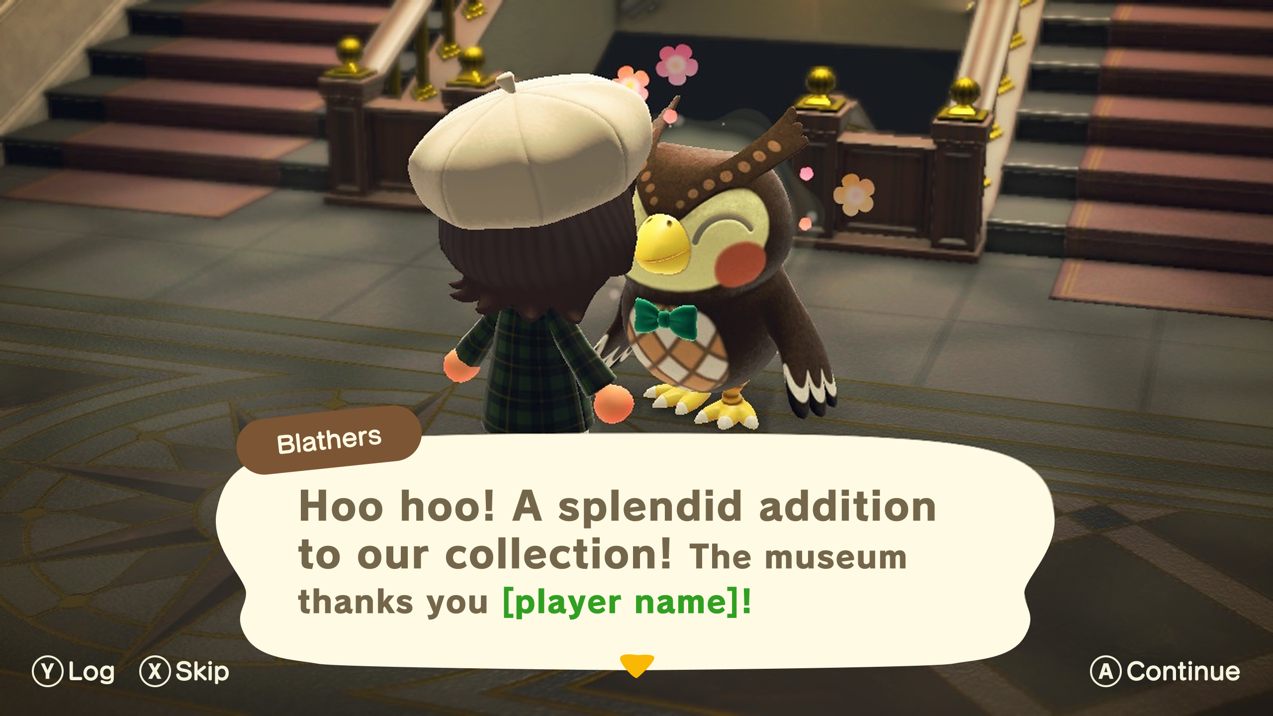
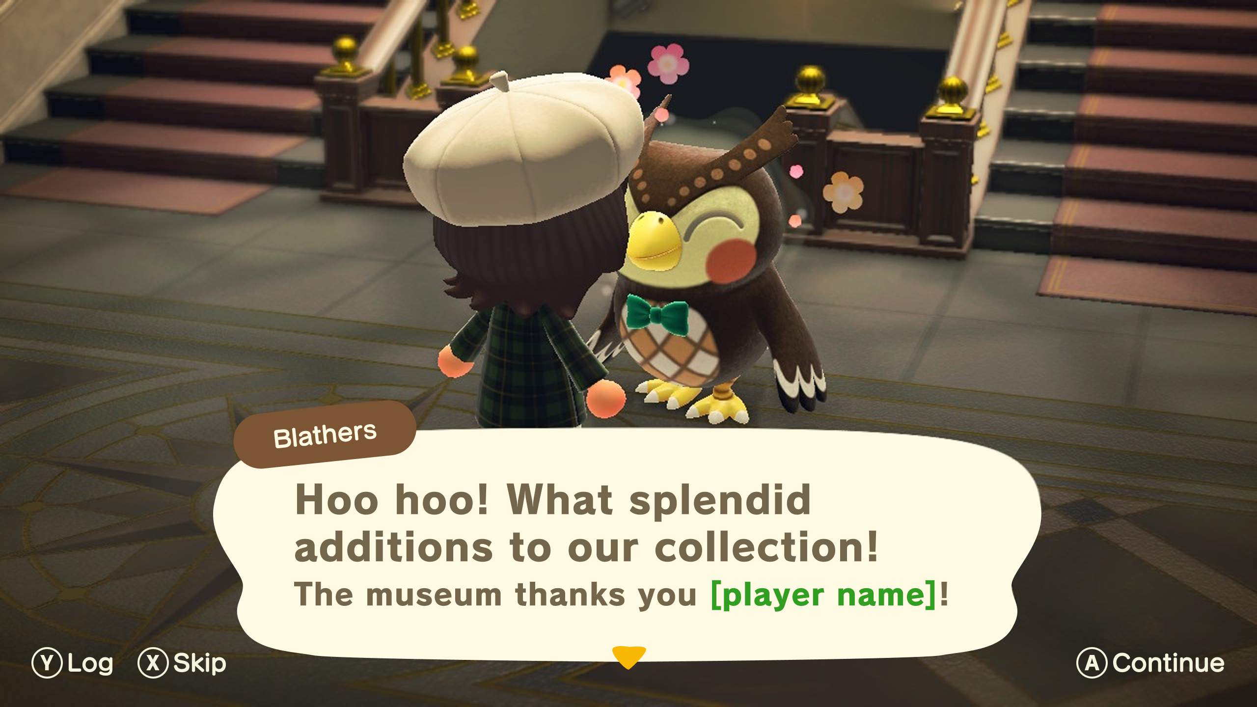
The Museum’s donation flow was one of the most friction-heavy interactions in the game – multiple menus, repetitive dialogue, and no way to skip any of it. The redesign stripped it back to its essential steps without losing any of Blathers’ charm.
Key decisions include:
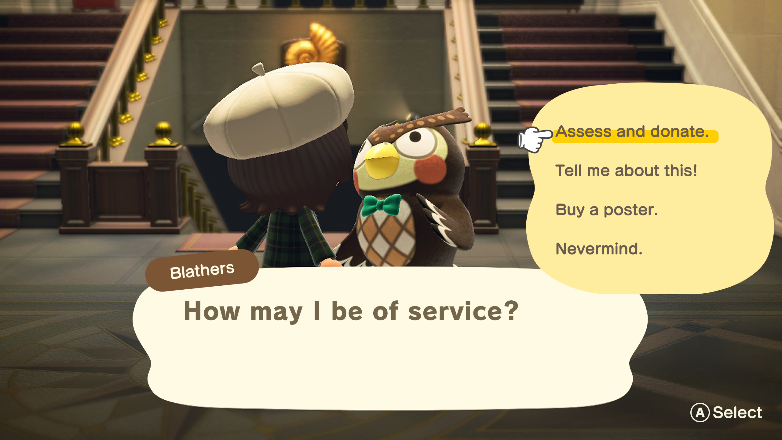
- Merged “Assess fossils” and “Make a donation” into a single “Assess and donate” action – while the current game allows players to assess fossils without donating them, a first-time fossil is almost always donated on assessment. Separating them into two menu items adds unnecessary navigation for the vast majority of interactions
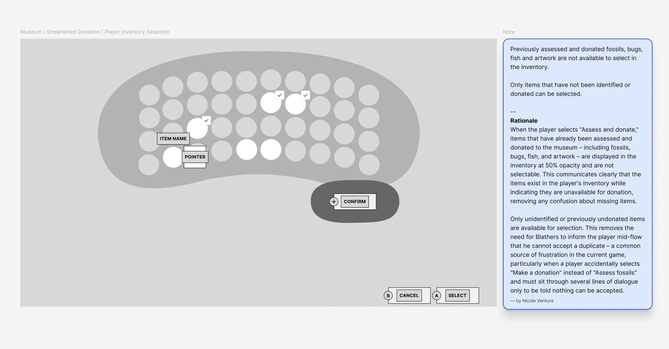
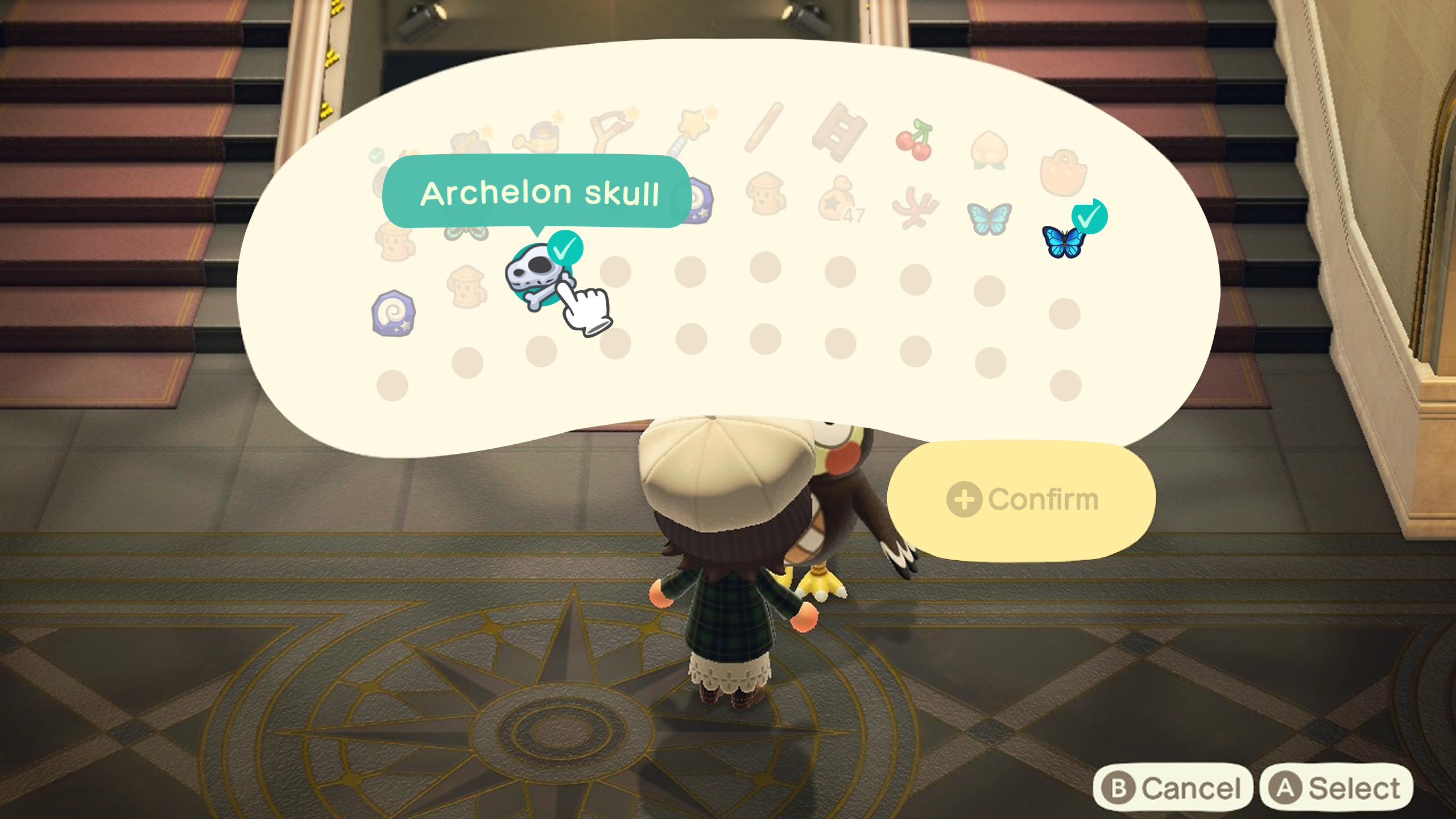
- Pre-filtered the donation inventory so already-donated items are displayed at 50% opacity and unselectable – removing the need for Blathers to reject duplicates mid-flow
- Selecting an unidentified fossil in the inventory triggers an animation that transforms it into its identified state, revealing the fossil’s name – giving players immediate confirmation of what they’re donating before they commit
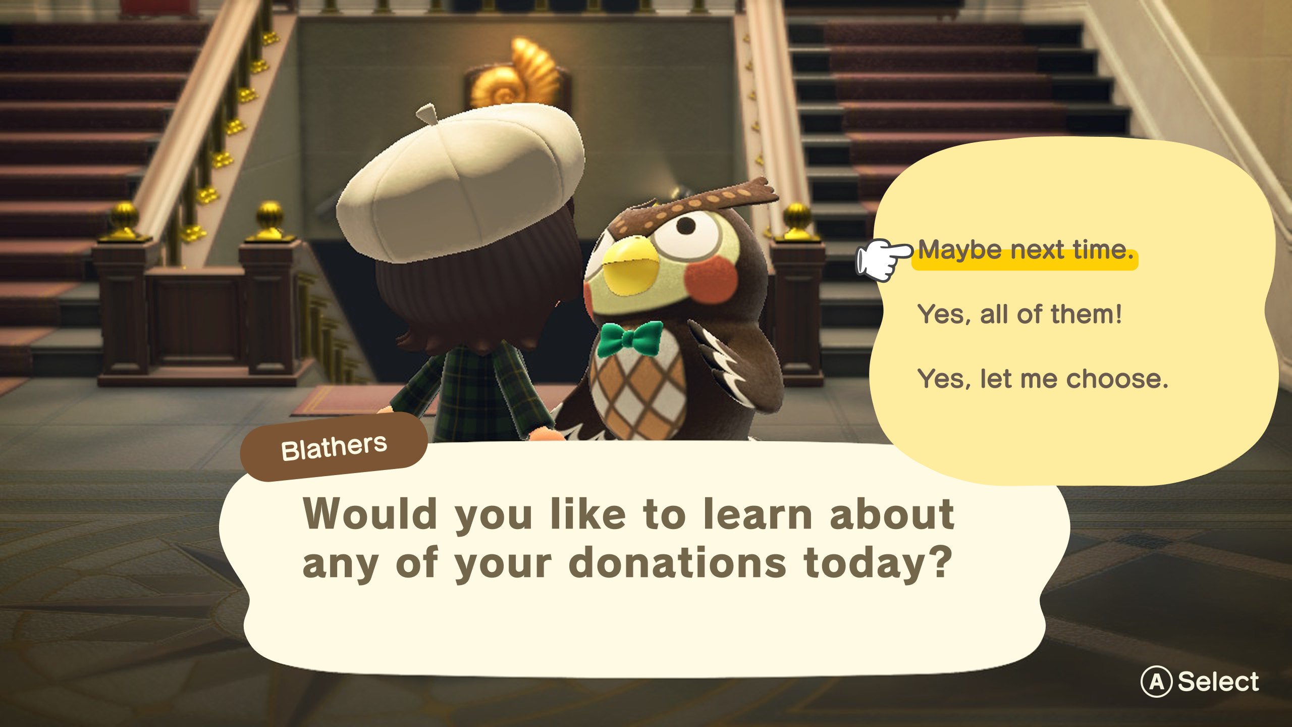
- Restored the opportunity to learn about donated fossils post-donation – after Blathers’ thank-you, players are prompted to select which donations they’d like to learn more about, with Blathers speaking to each specifically. This preserves the museum’s educational and characterful moments without making them mandatory
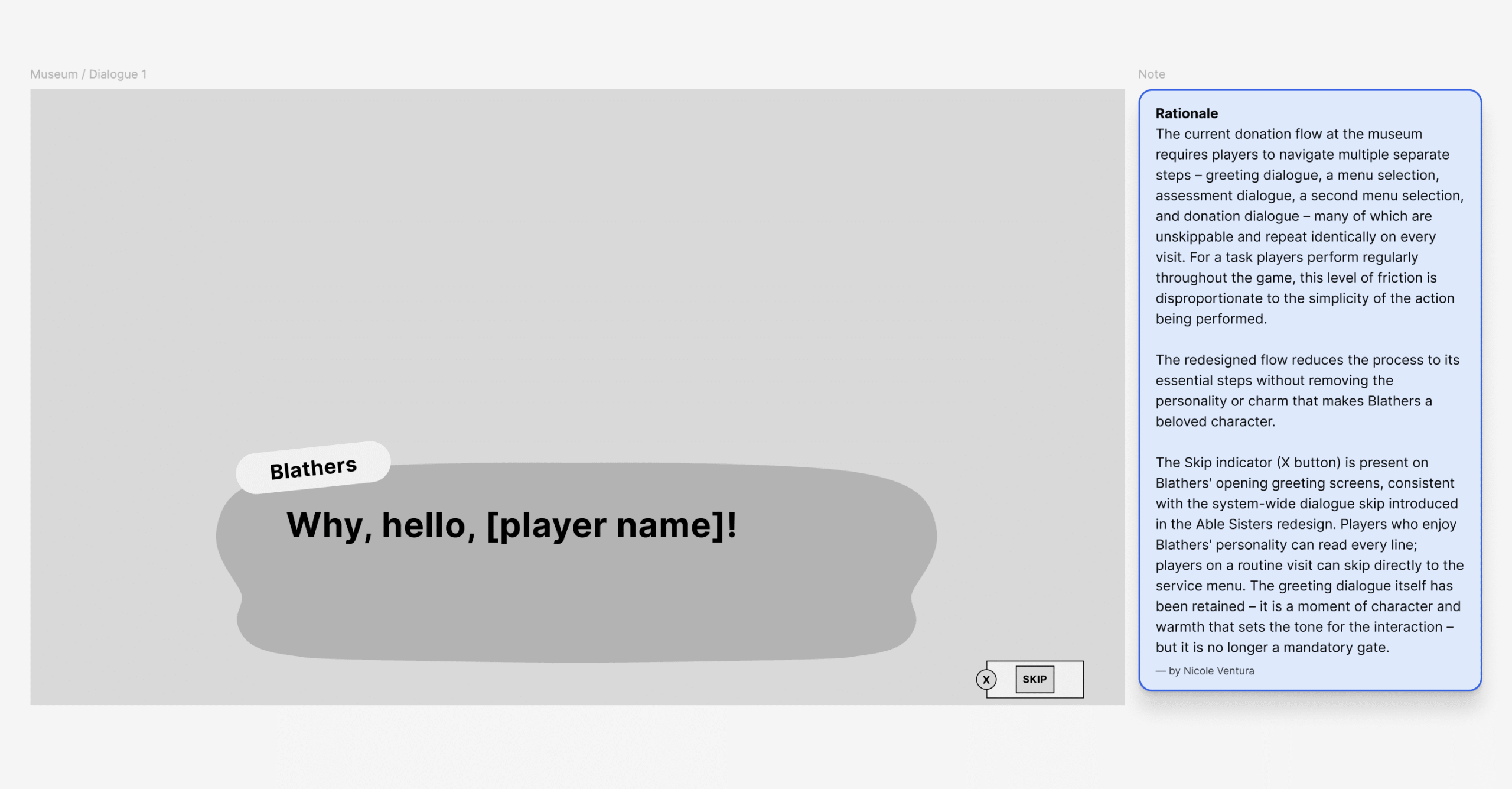
- Introduced a system-wide Skip, Log, and Continue dialogue control set across all three redesigned experiences – giving players full agency over how they engage with dialogue without removing it
process – UI exploration & execution
native by design
The visual design phase was about one thing: making every new element feel like it had always been there. Existing UI icons and patterns were recreated from scratch in Adobe Illustrator and Figma, real item imagery was sourced directly from Nookipedia, and new elements were carefully adapted to fit ACNH’s visual language. The result is a redesign that respects the game’s identity while quietly fixing everything that was working against it.
Key decisions include:
- Maintained full consistency with ACNH’s existing visual identity throughout – new UI elements were designed to feel native to the game rather than imported from outside it
- Many existing UI icons and patterns were recreated from scratch in Figma and Adobe Illustrator – screenshotted elements were Image Traced, then refined using Path → Smooth and manual vector adjustments
- New icons introduced in the redesign (Nook Shopping category icons) were sourced from the Noun Project and adapted to fit the ACNH visual language
- Real item imagery was sourced directly from Nookipedia and used as product content across the Nook Shopping and Able Sisters screens, grounding the designs in real game content
- 22 hours of design work invested across research, wireframing, and high-fidelity UI design
Nook Shopping - Final UI Designs
Able Sisters - - Final UI Designs
Museum - Final UI Designs
the same game, without the friction
What started as a player’s frustration became a fully realized redesign – 19 high-fidelity screens across three core game systems, all designed at Switch resolution and grounded in real ACNH content and visual language. Nook Shopping was transformed from a flat alphabetical list into a fully navigable catalogue with categories, filters, and metadata-aware search. Able Sisters went from a restrictive single-session experience into a flexible, cart-based shopping flow. And the Museum donation flow was stripped back from a multi-step, dialogue-heavy process into a streamlined single-action experience.
The redesign doesn’t try to change what Animal Crossing is. It removes the friction that was never supposed to be there in the first place – making the catalogue easier to navigate, the shopping experience more intuitive, and every visit to the Museum a little less of a chore. Every change was made in service of the game’s own promise: a relaxed, creative, player-driven experience with no pressure and no rush.