Five Sense Collective
role
Lead Designer
Scope
UX/UI (Website) Design, Branding + Visual Identity
Industry
Wellness
Timeline
2022-2023
introduction
Five Sense Collective is a multi-sensory wellness company based in Malibu, CA and Austin, TX – offering sound healing journeys, training courses, and event design and consulting. As they expanded their mentorship offerings, Five Sense Collective partnered with Bryant Wood to introduce a new Breathwork Ceremony Training program within their Academy.
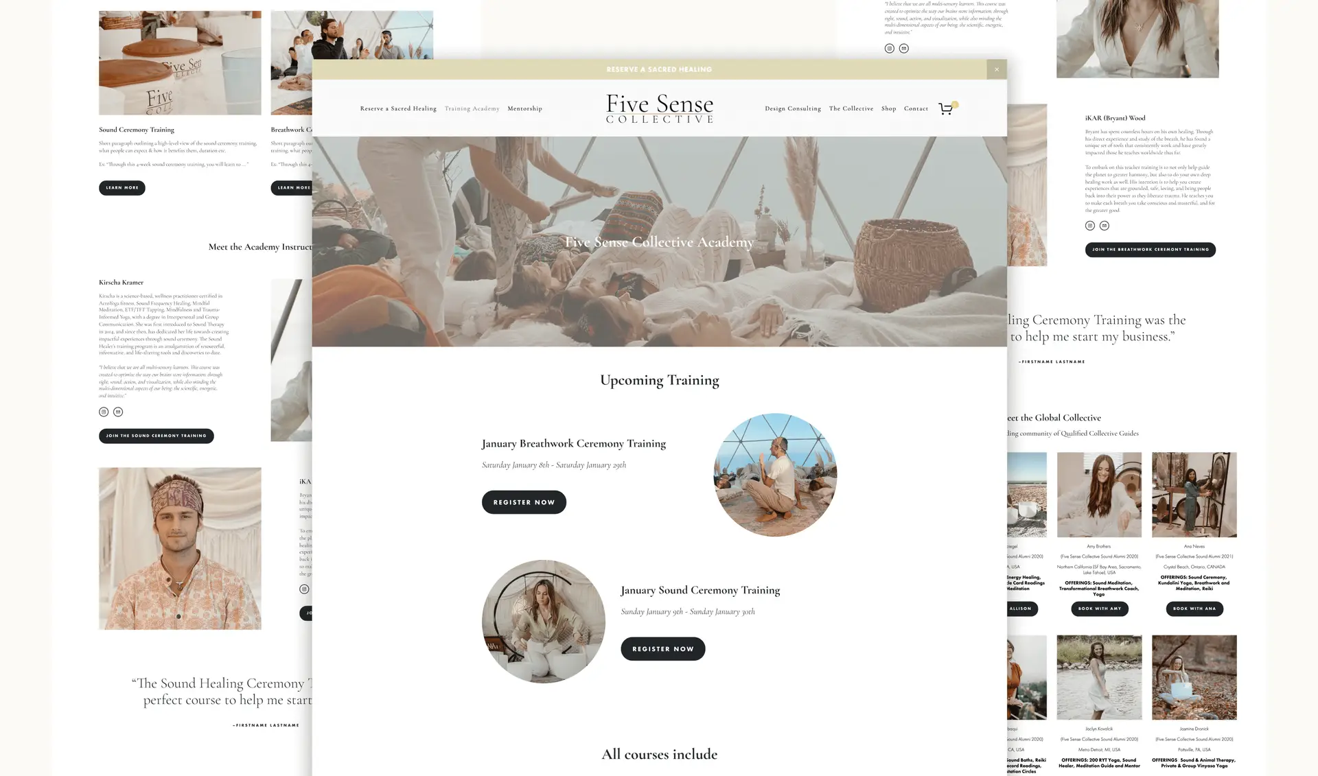
I collaborated with the founder of FSC to support this launch by designing the printed Breathwork Ceremony Training Manual for students, as well as designing and building the Breathwork Training landing page in Squarespace. I also updated the Sound Ceremony Training and Five Sense Collective Academy pages to ensure the new program felt cohesive and integrated across the digital experience.
objectives
Support the launch of the Breathwork Ceremony Training program within the Five Sense Collective Academy
Design a printed training manual that clearly organized course material and allowed space for student notes and reflection
Create a dedicated landing page to explain the training and guide prospective students through enrollment
Update existing Academy and Sound Ceremony Training pages to ensure a cohesive, intuitive experience across the platform
The Process – Breathwork Ceremony Training Manual
a training manual designed to guide, support, and inspire
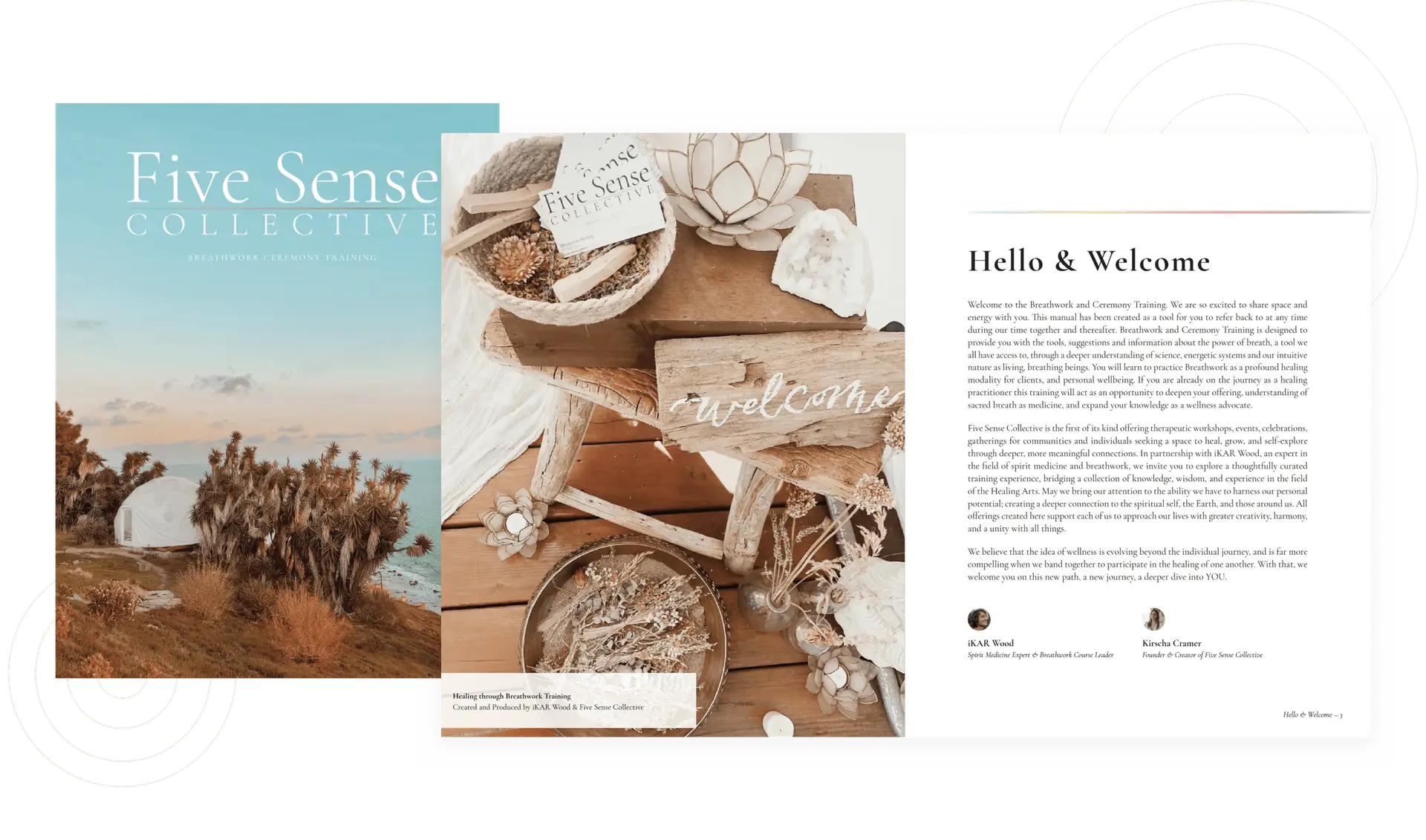
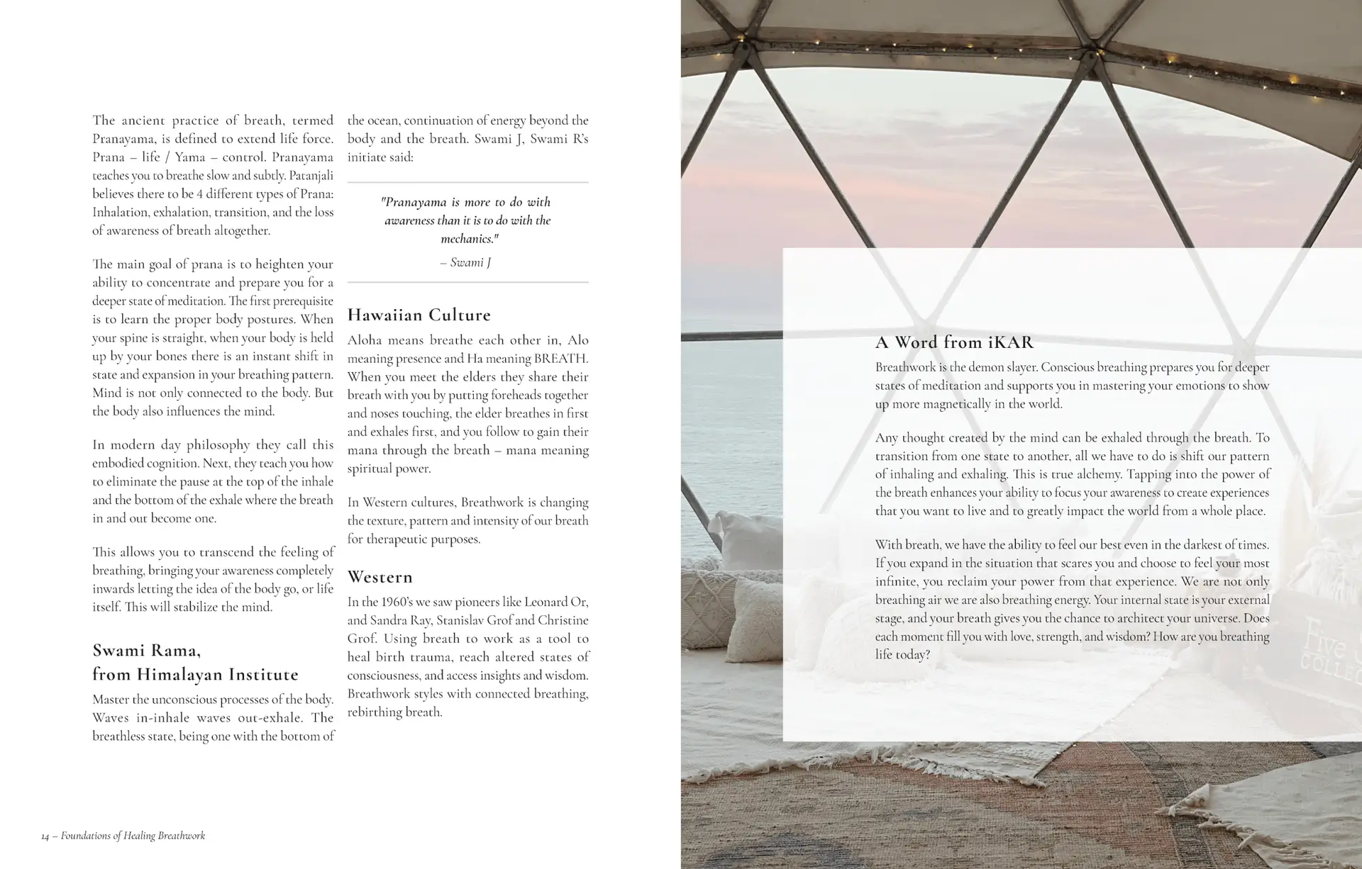
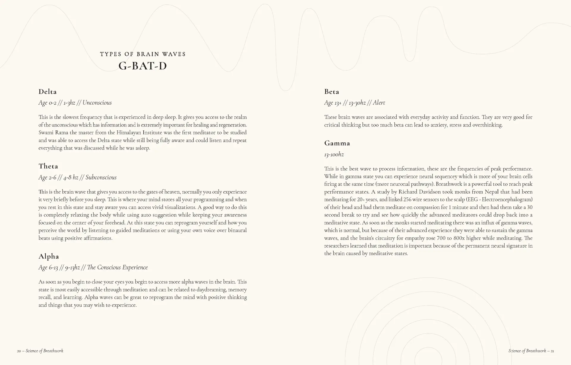
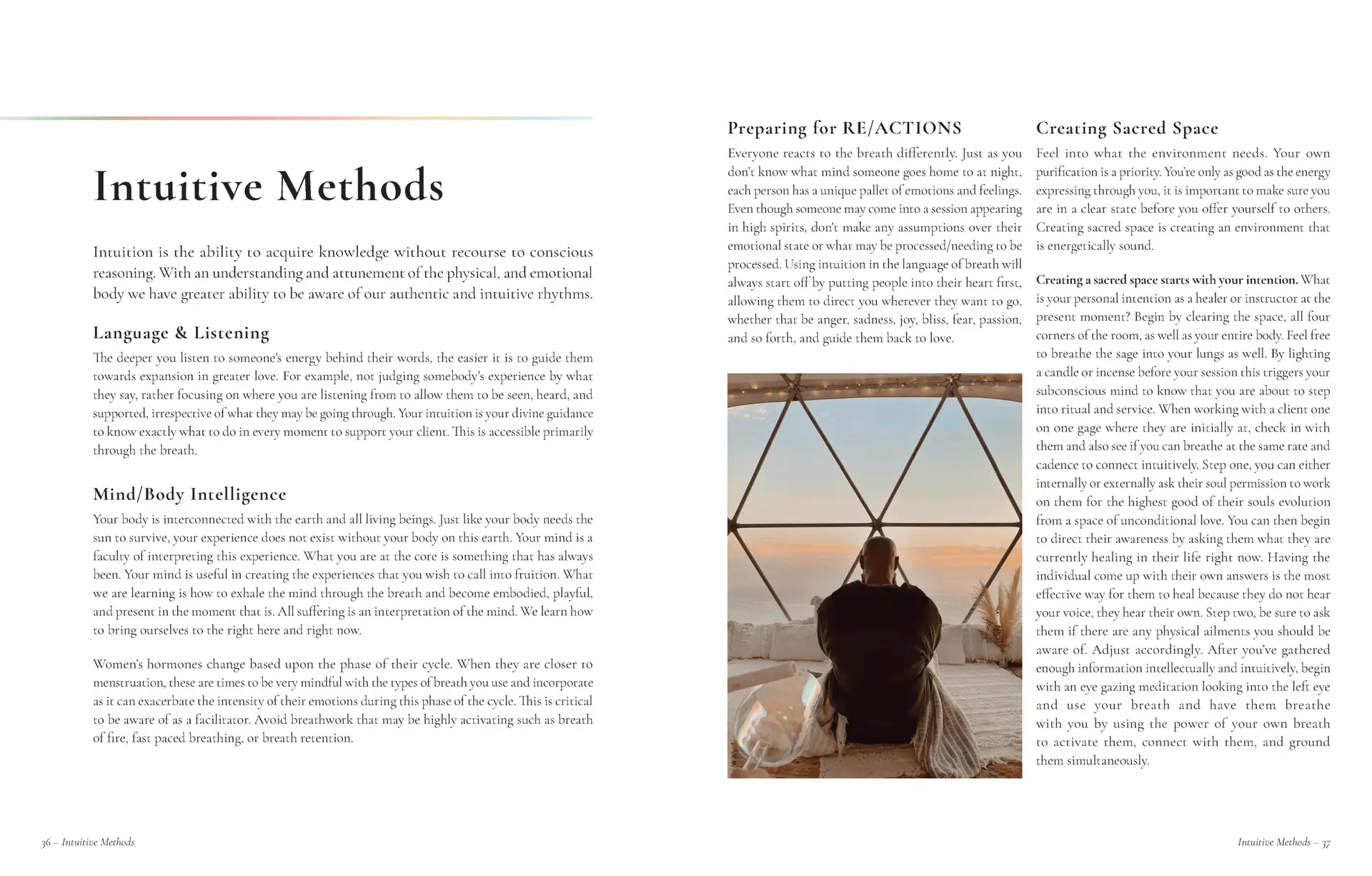
To support the launch of the Breathwork Ceremony Training program, I designed a printed training manual that expanded on the structure and visual language of Five Sense Collective’s existing materials. Working within the brand, I applied their typography, color palette, and imagery in a way that felt calm, spacious, and aligned with the energy of the practice. The layout was intentionally designed to be easy to navigate for both instructors and students, with clear hierarchy, generous spacing, and page references that made the material simple to follow, reference, and revisit throughout the training.
The Process – Training Landing Page + Academy Updates
an intuitive path to training & enrollment
To support the launch of the Breathwork Ceremony Training program, I designed and built a dedicated landing page in Squarespace and updated the Five Sense Collective Academy and Sound Ceremony Training pages to reflect the new offering. I planned the layouts and information flow in Figma to create a thoughtful experience within the existing site structure, clearly outlining the training, instructors, and registration details. The result was an intuitive experience that made it easy for prospective students to understand what to expect and feel confident signing up.

clear, cohesive experiences for students and instructors
The Breathwork Ceremony Training manual and updated Academy pages provided students and instructors with a clear, approachable way to engage with the program. The manual offered an intuitive layout for learning and reference, while the digital pages made it easy for prospective students to explore the program and sign up confidently. Kirscha shared that the updates strengthened the overall Academy experience and made the new training program feel polished, cohesive, and fully integrated into Five Sense Collective’s offerings.
more projects to explore
UI/UX Design (Website)
Visual/Graphic Design
Welcome to Travel
Provided ongoing design and maintenance to Welcome to Travel’s marketing and resources websites, ensuring they remained engaging, user-friendly, accessible, responsive and on-brand. Also maintained a cohesive brand experience through the creation of tour brochures, presentations, and other marketing collateral.
UI/UX Design (Website)
Branding + Visual Identity
Great Oak Manor
Brand identity and website redesign for a luxury boutique hotel on Maryland’s Chesapeake Bay – bringing a fresh, contemporary feel to match their evolving guest experience.
